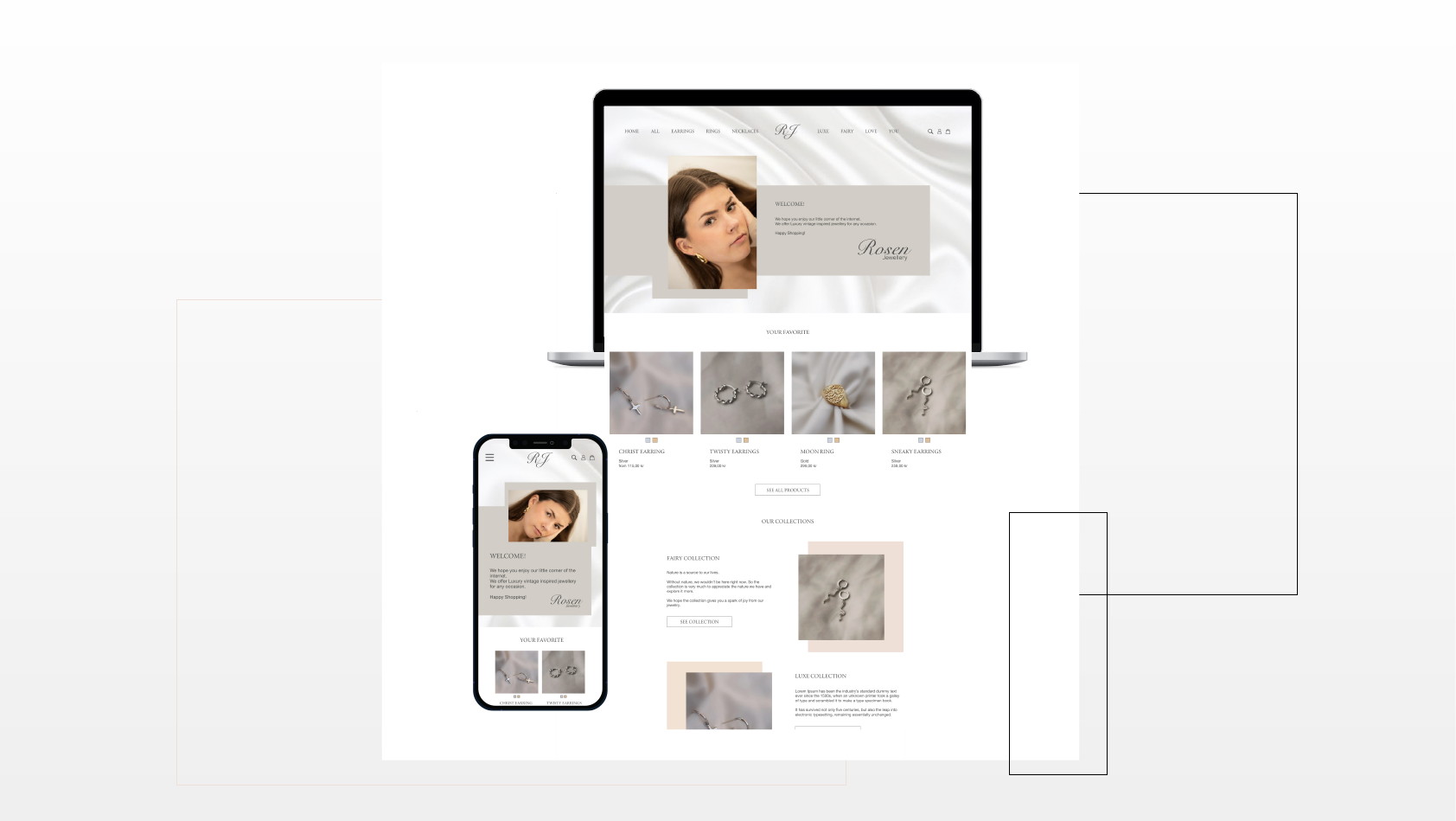
This home page prototype was designed and developed as a part of potential clients competition, where there were chosen 5 companies that were offered free visualisation of their (re)designed home page.
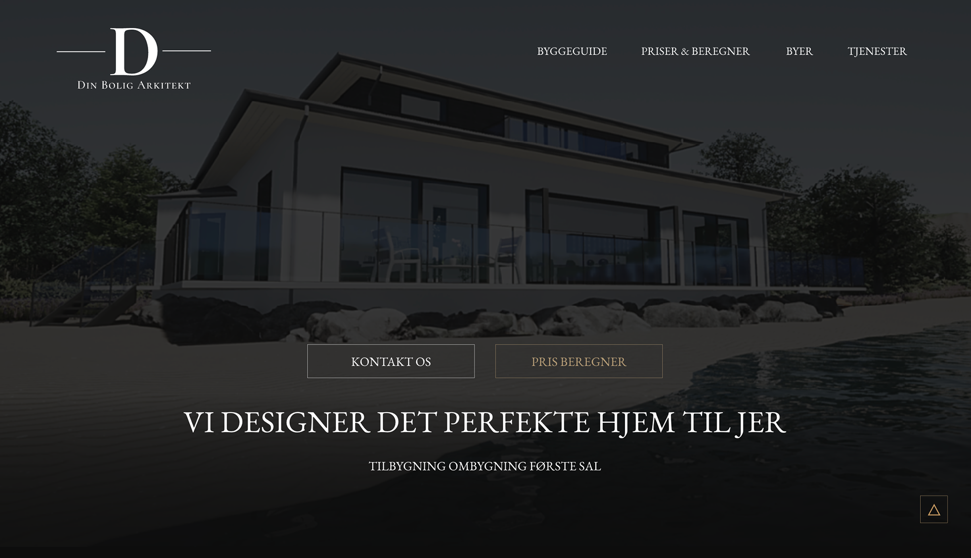
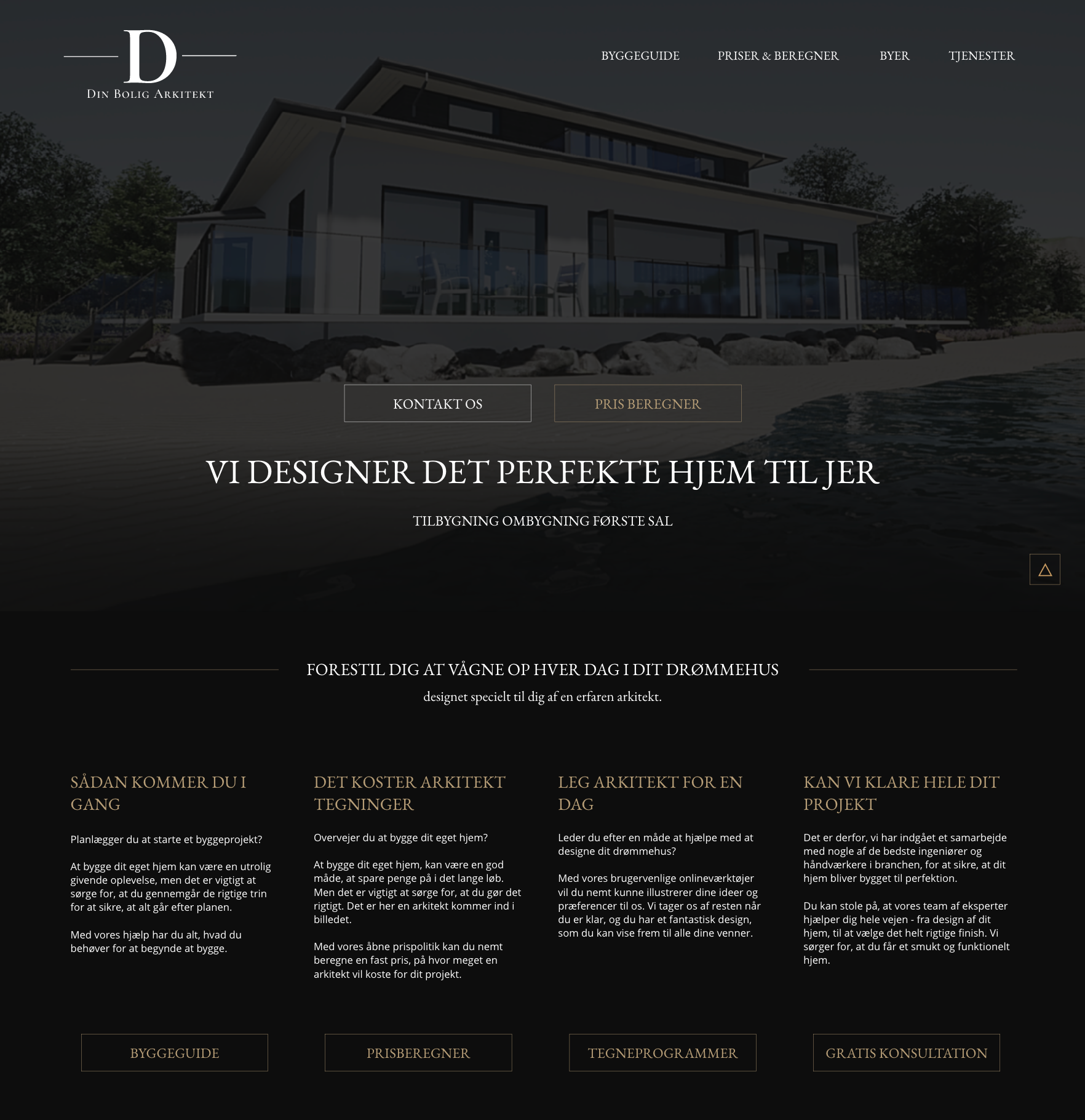
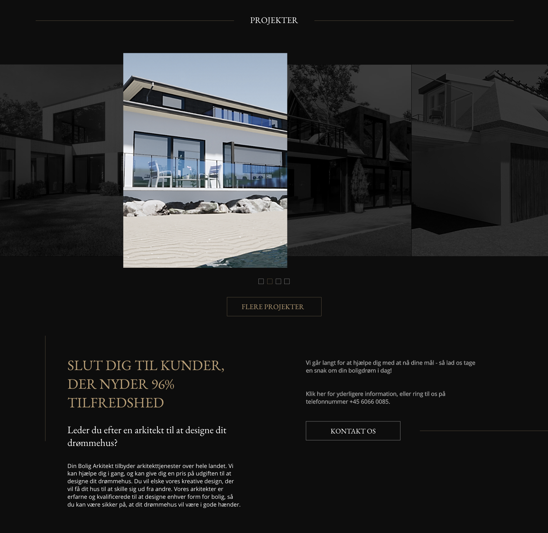
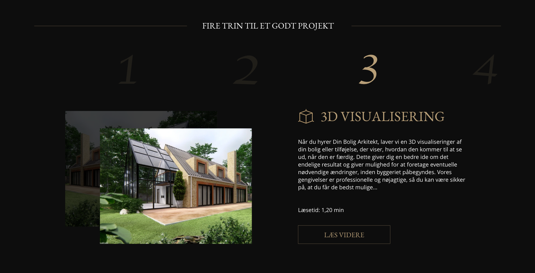
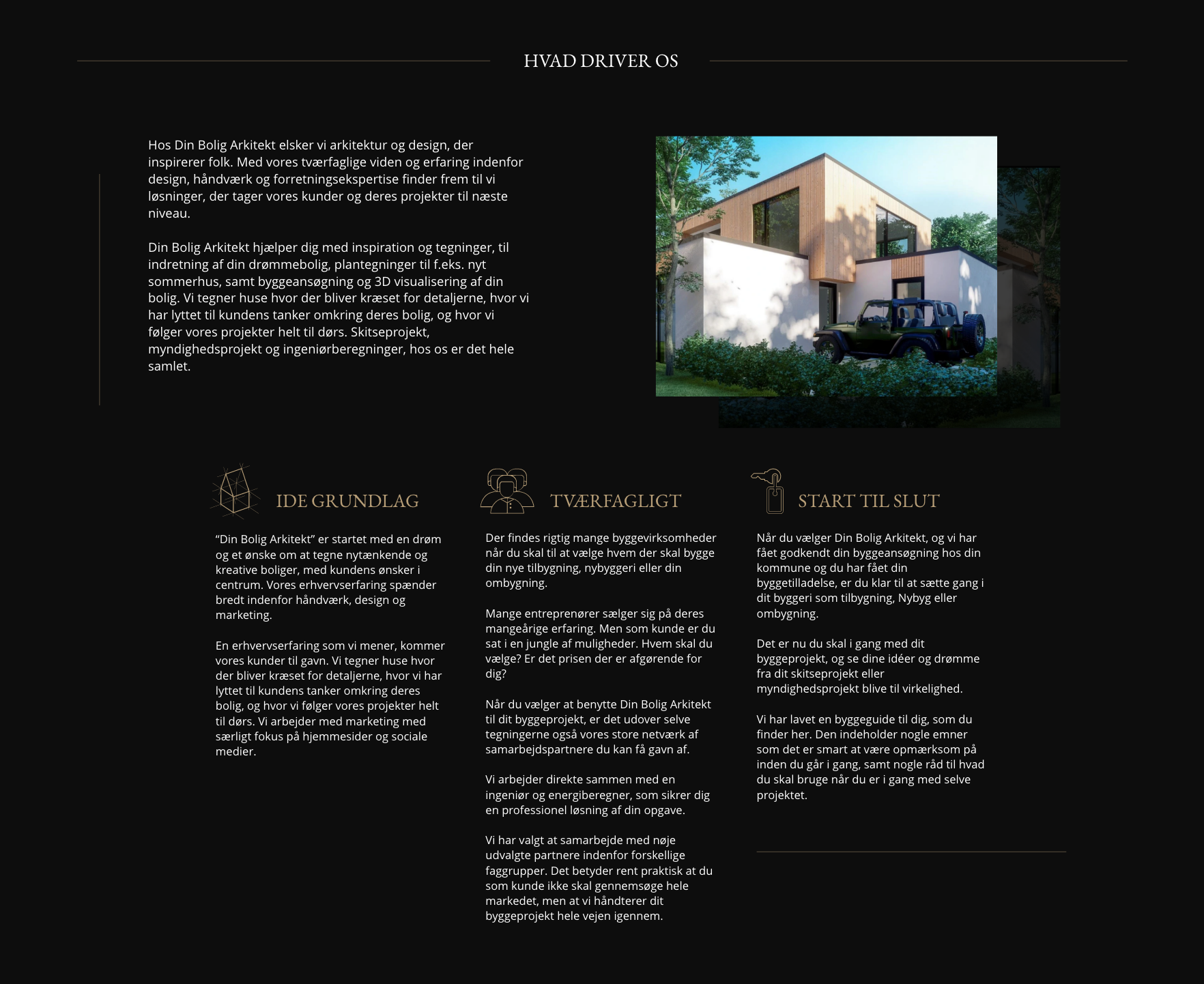
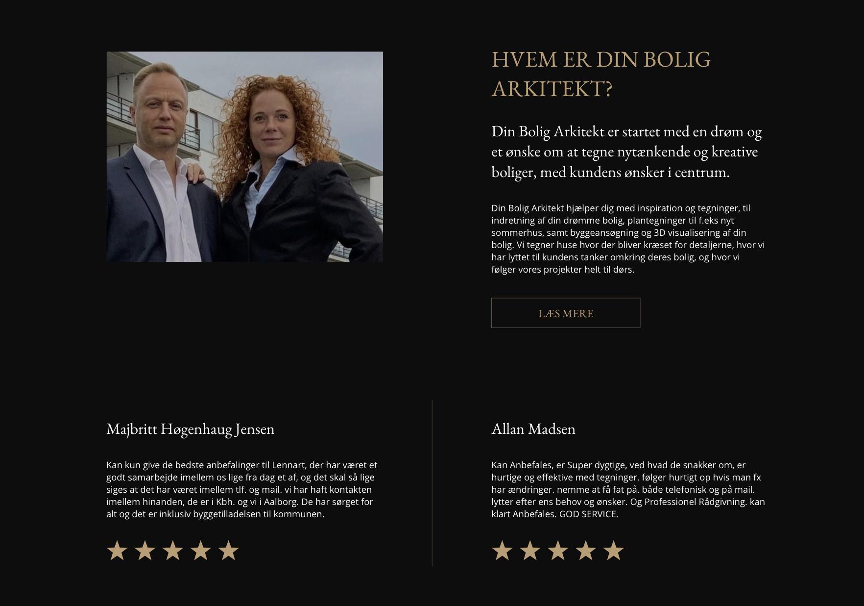
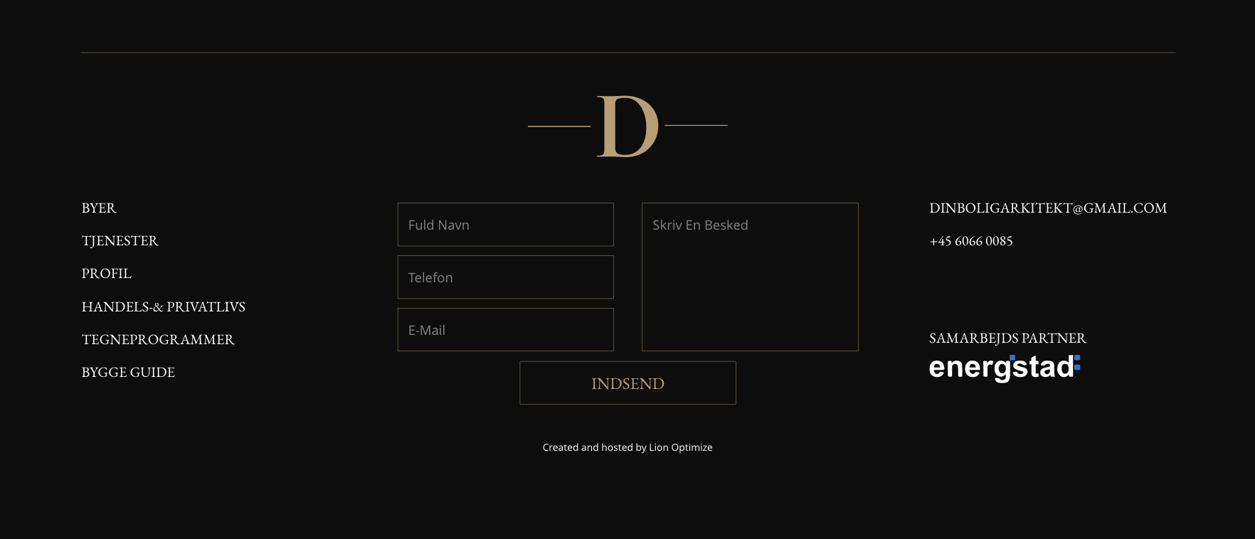
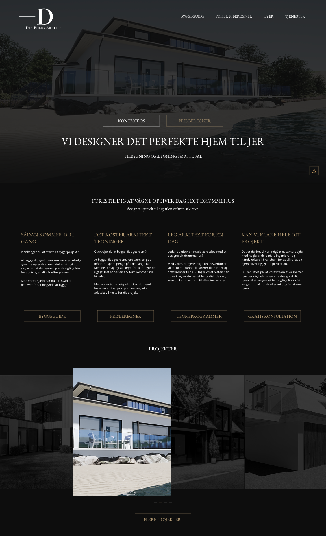
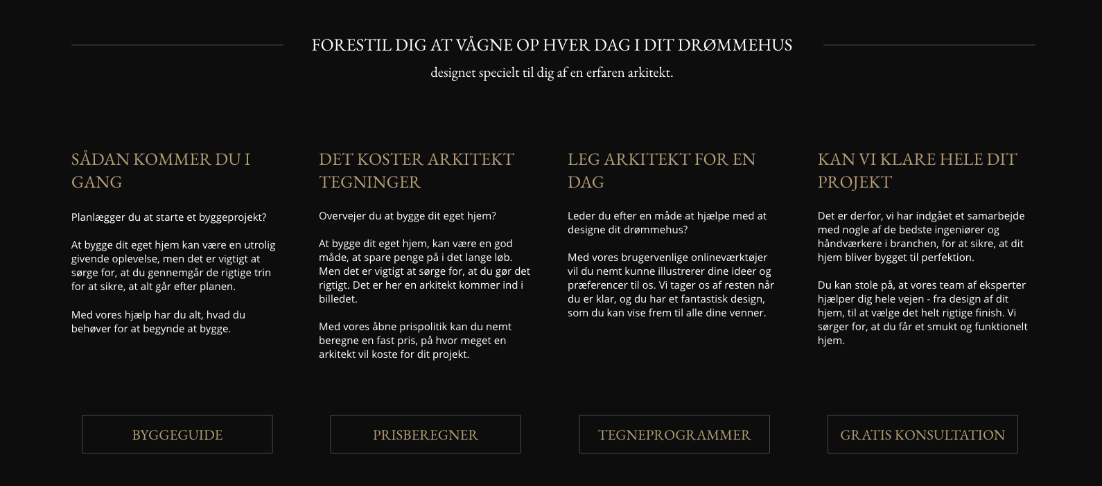
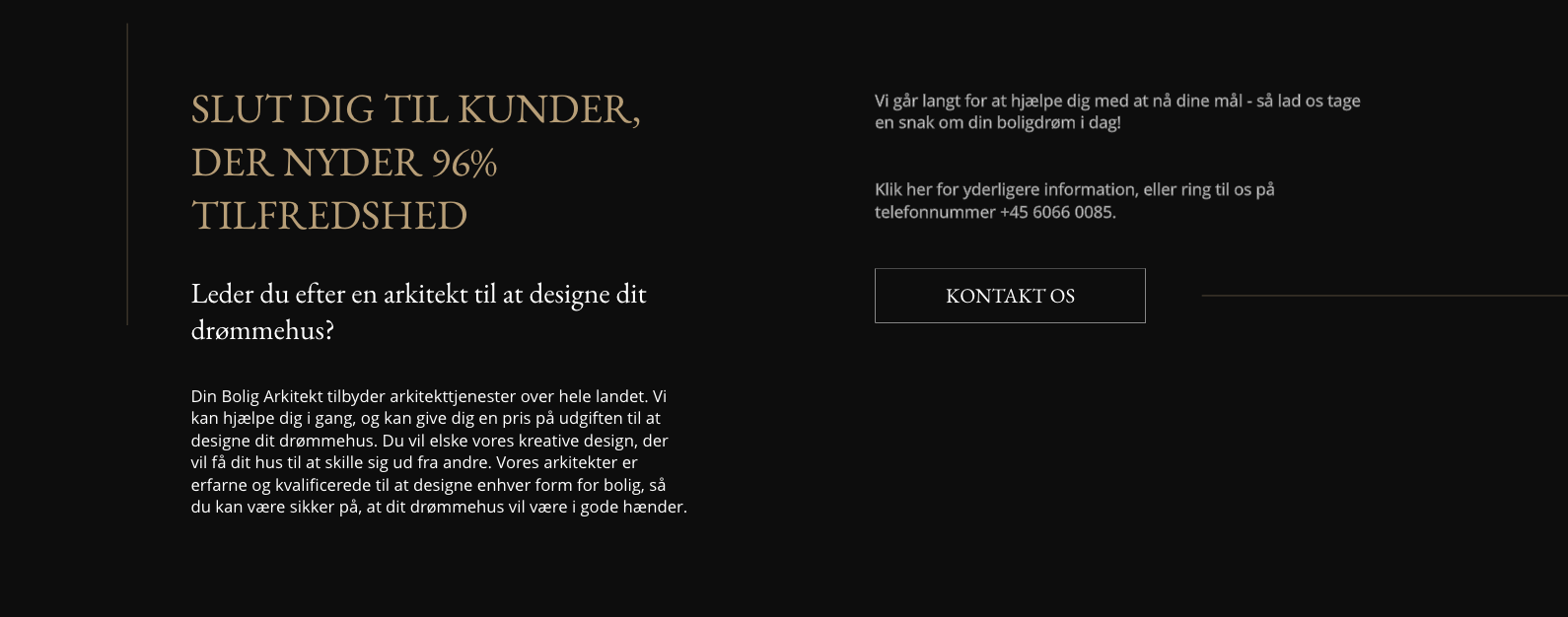
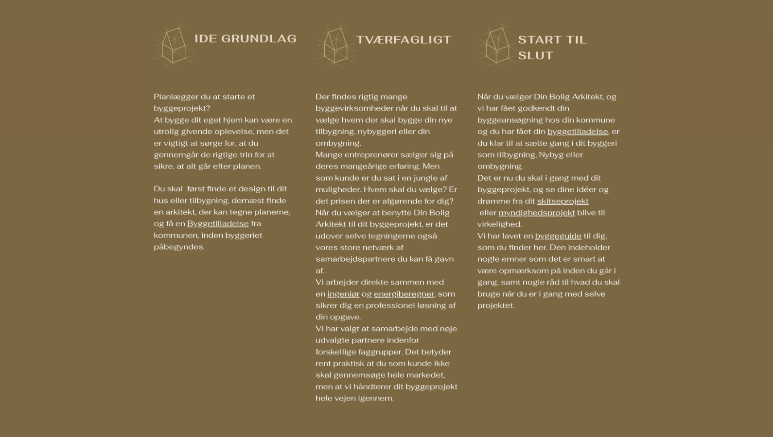
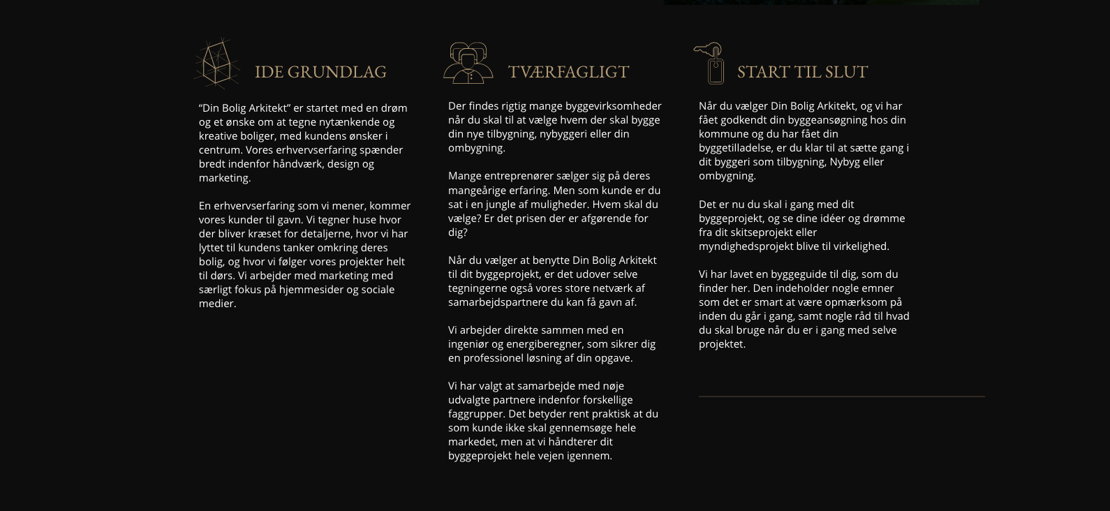
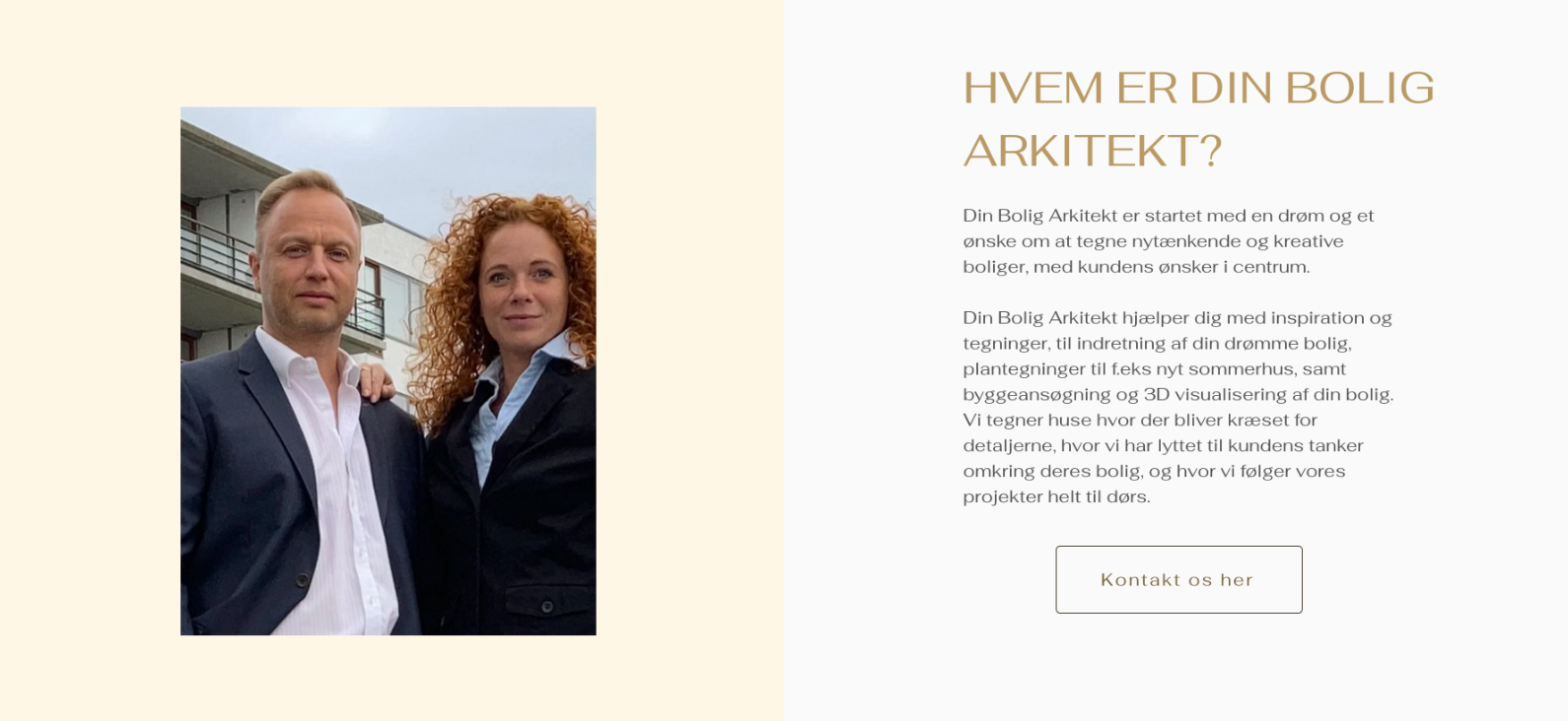
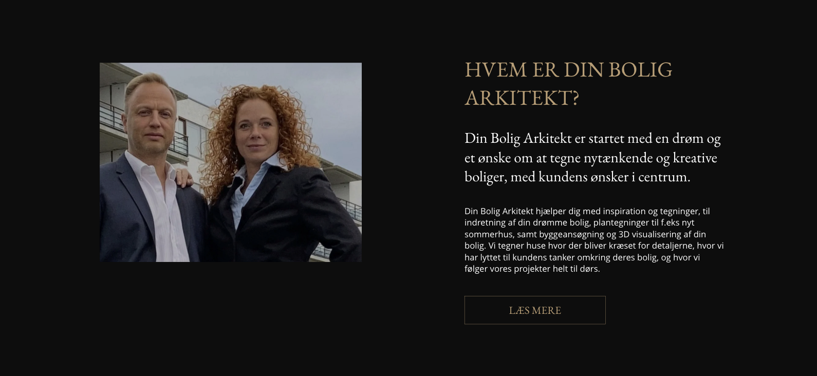
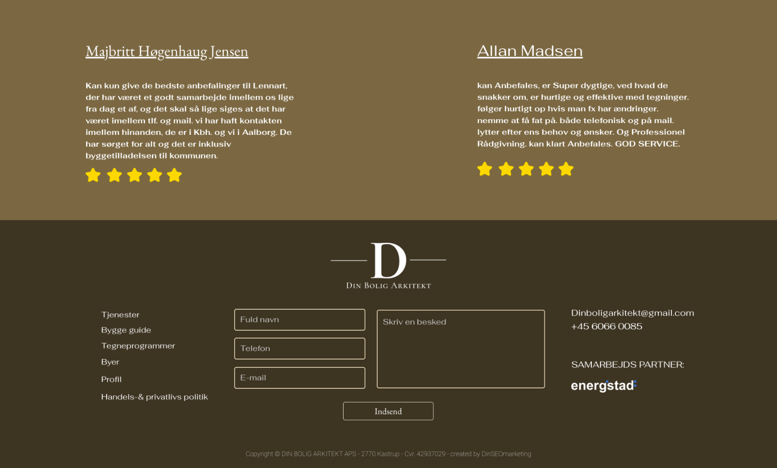
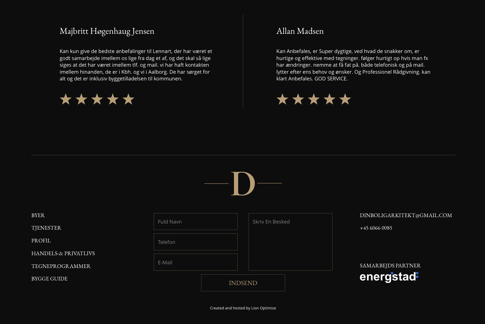
I did the biggest changes within the layout itself and the colour scheme that I strongly narrowed to support simplicity and clean elegant style. Based on my research on luxurious businesses, I designed and developed the home page prototype using dark colour background in contrast with the visual and verbal content combined with elements of gold colour. As the client had a lot of verbal content that needed to be displayed, I designed a few functional sections that would help to simplify the layout using buttons and clickable images.
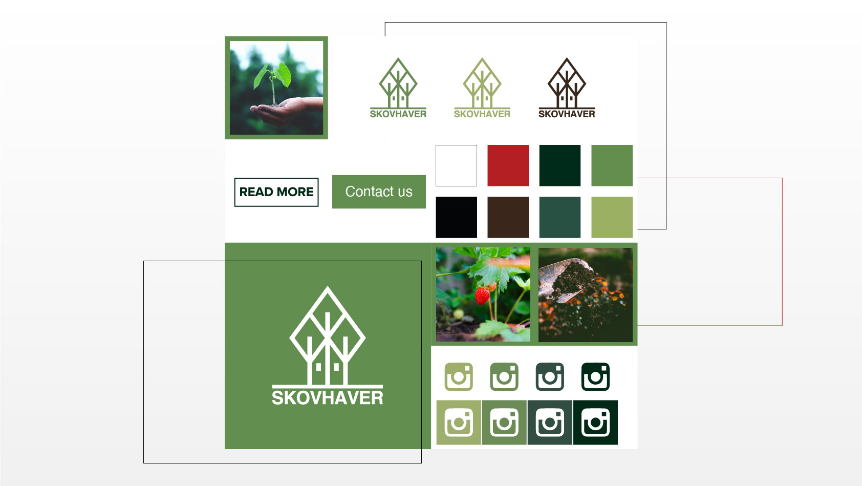
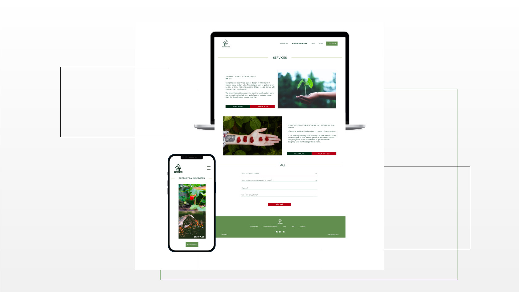
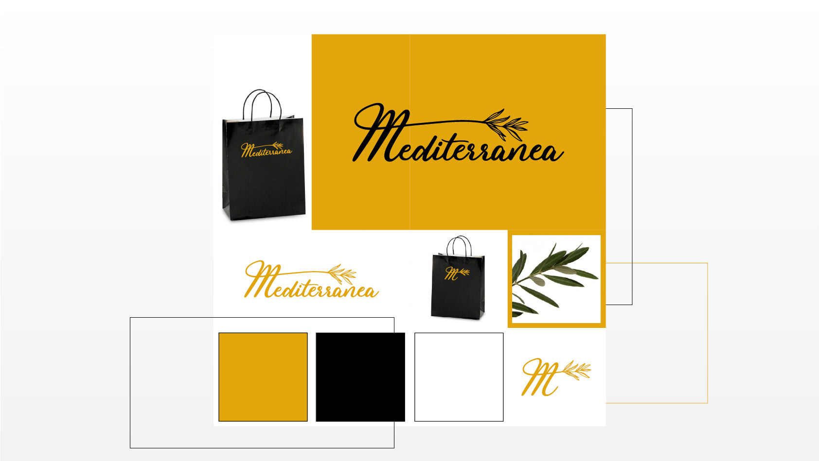
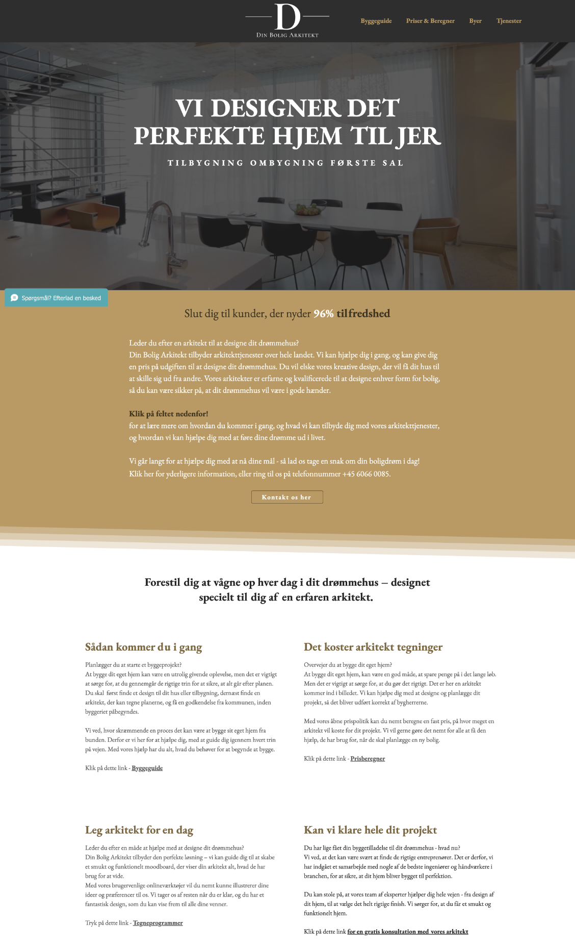
Due to current time management and budget, the company decided to implement as many elements of the design as possible on their own, as you can see later on this page.
prototype, home page, website, Gestalt principles, structure, layout, negative space, focus, simplicity, elegance, modernism, luxury
Adobe Xd
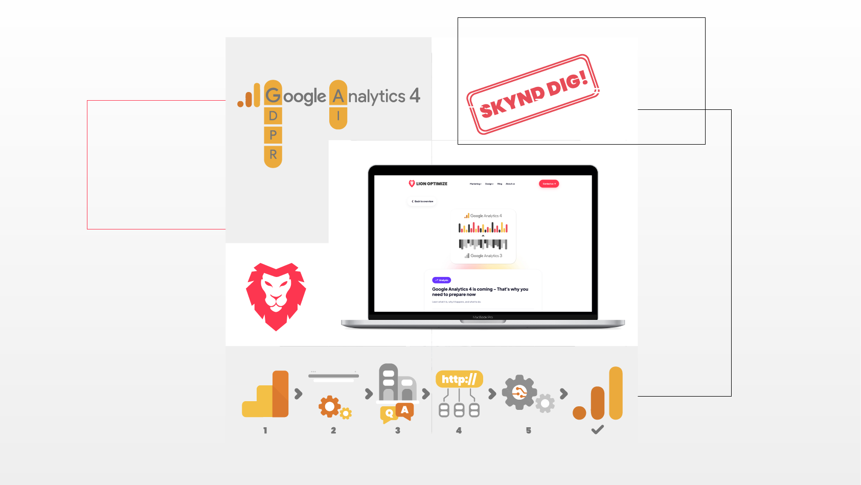
HOME PAGE
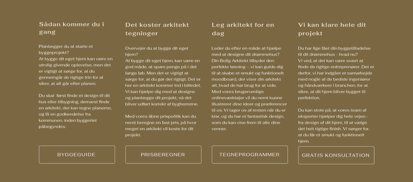
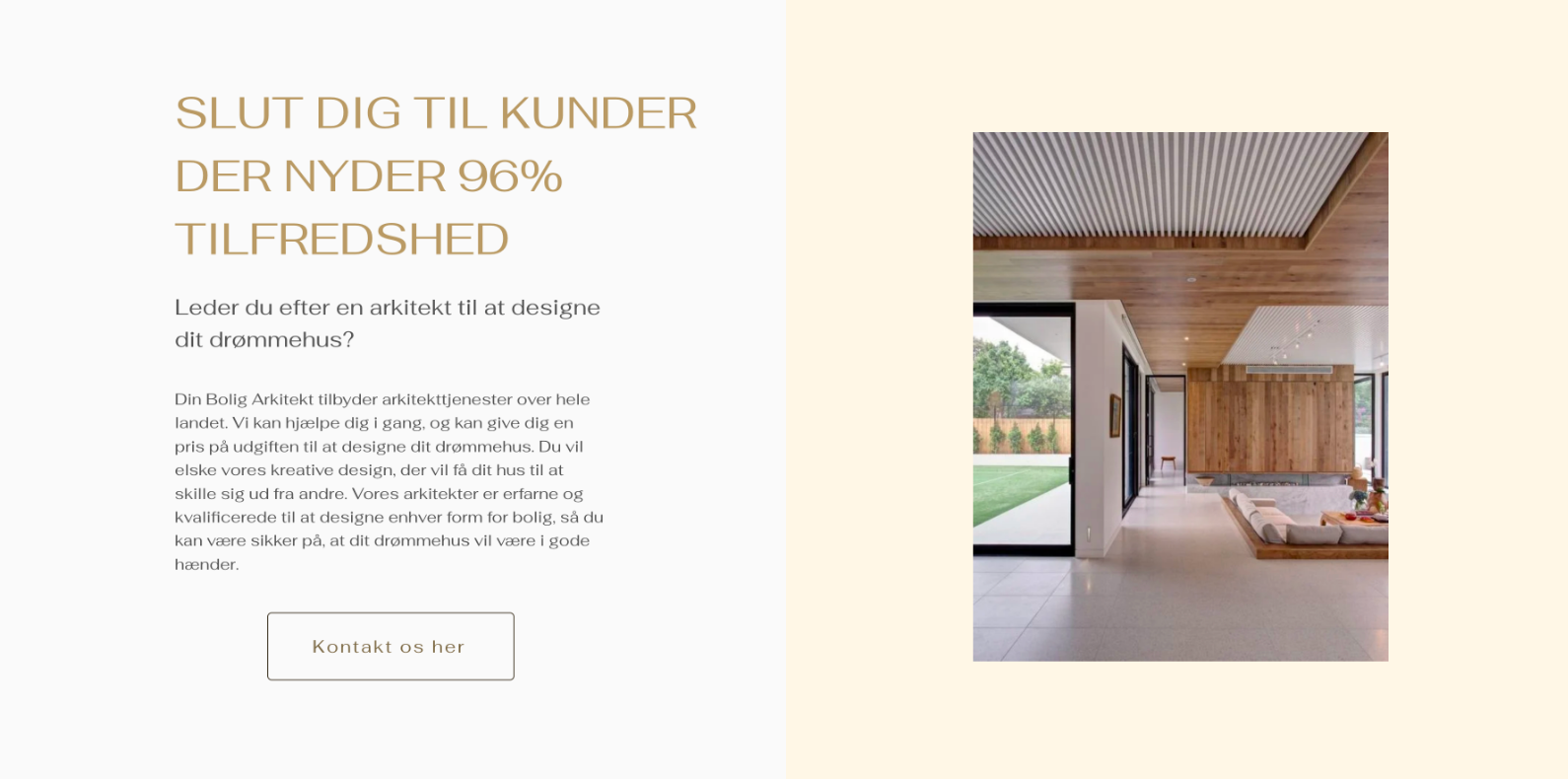
CLIENT'S ORIGINAL WEBSITE vs. PROTOTYPE
IMPLEMENTATION OF PROTOTYPE ELEMENTS
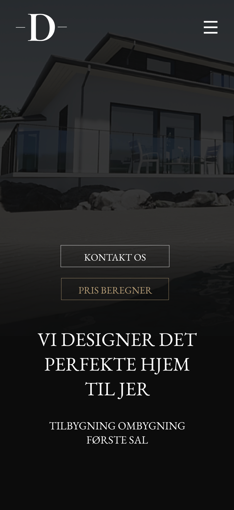
LAPTOP vs. MOBILE VERSION