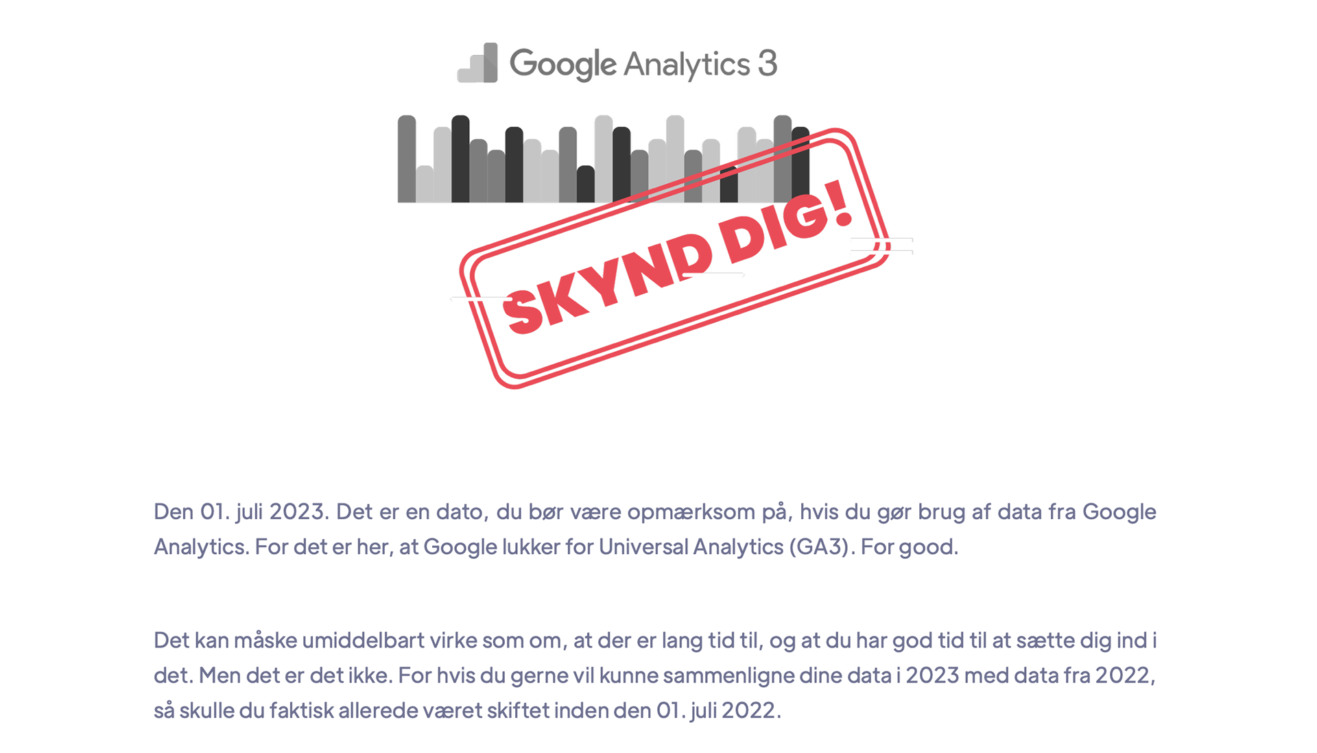
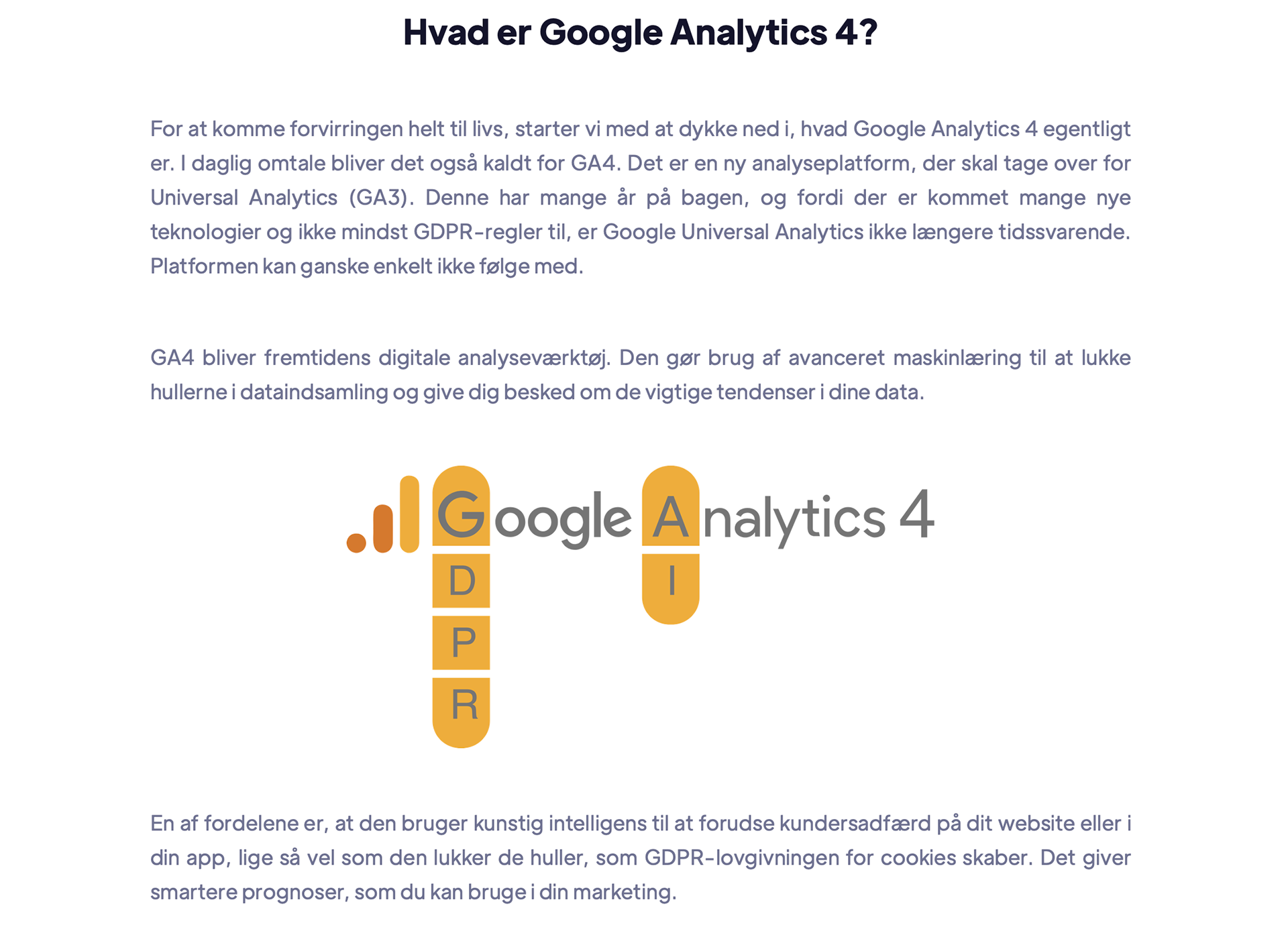
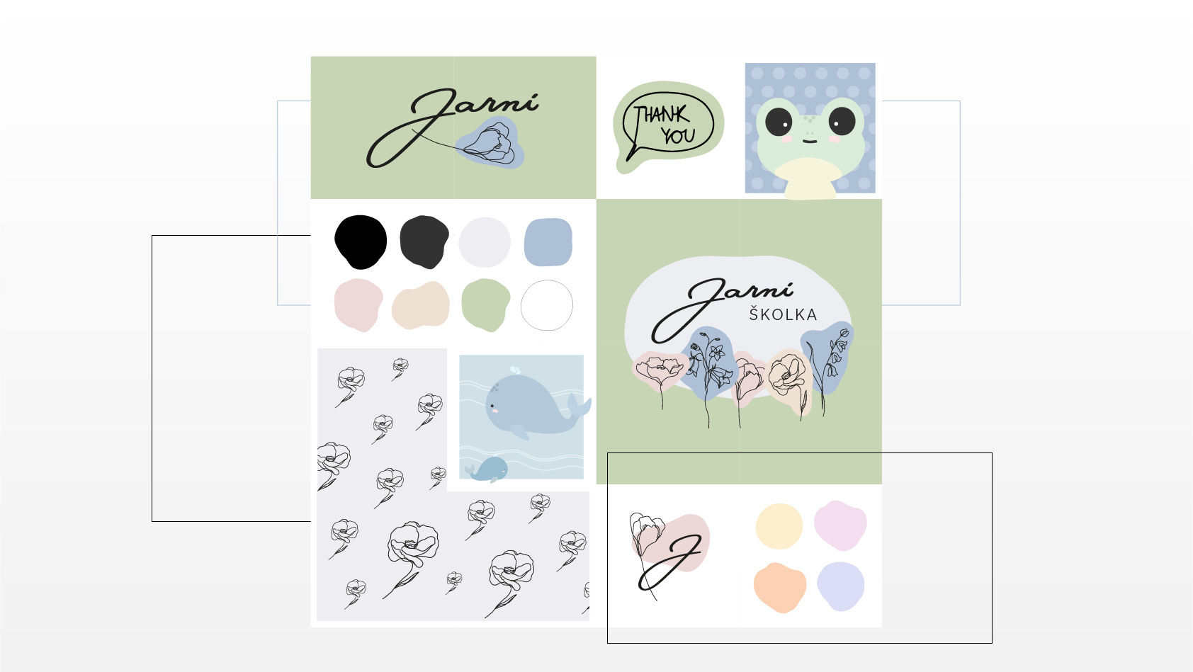
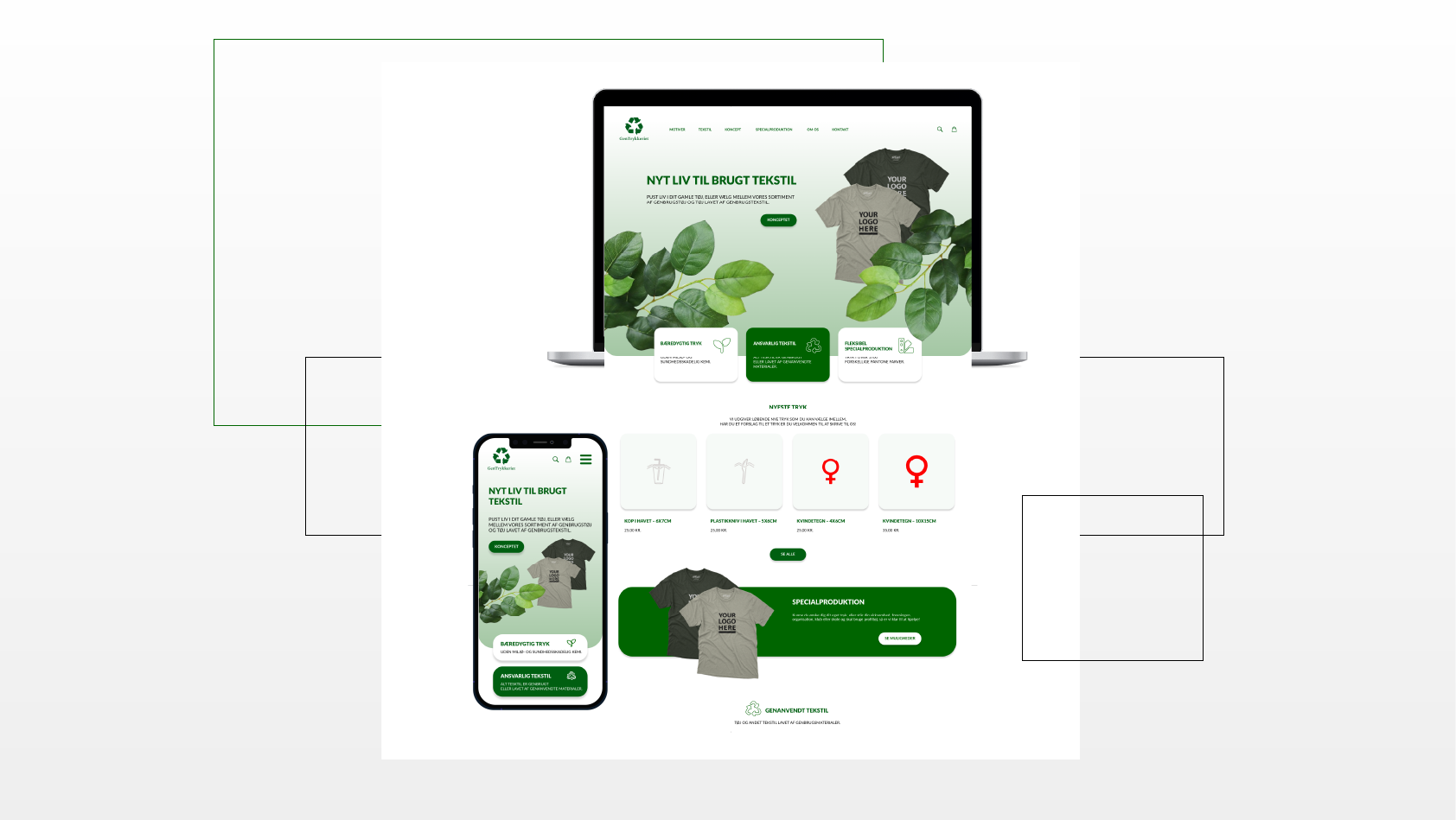
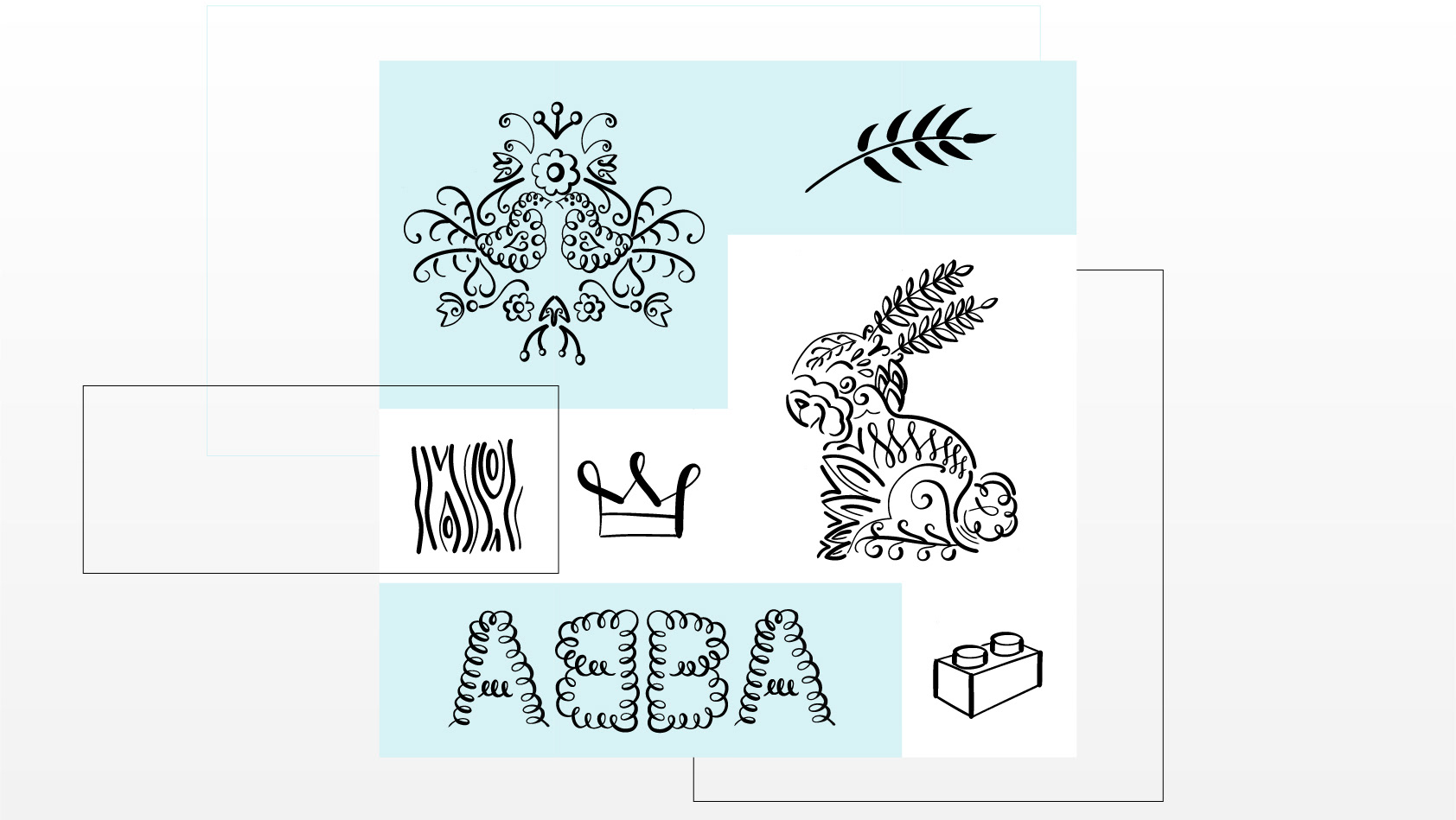
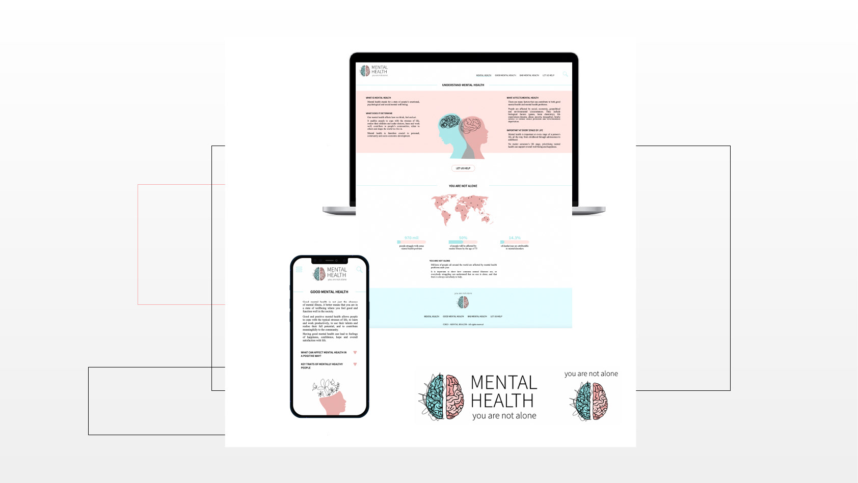
I developed illustrations for a blog post based on the company's simple and very graphic identity. Their online presence is linked to simple solid bold colour shapes, of specific shades of pink-red and grey. I used contrast of these colours to create hierarchy within illustrations. Only important elements related to key info of the specific post section were displayed in the pink-red shade and colours of the GA. The company's visual content consists also of specific illustrative characters. I worked with them to assure perfect match to their identity and easy way for customers to link the visual content to the company.
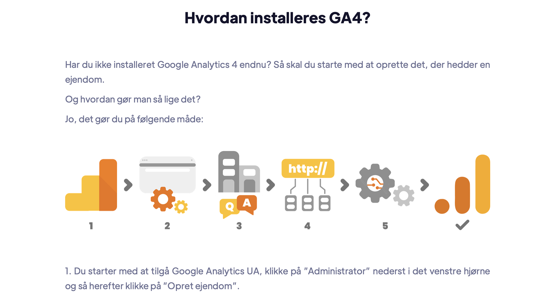
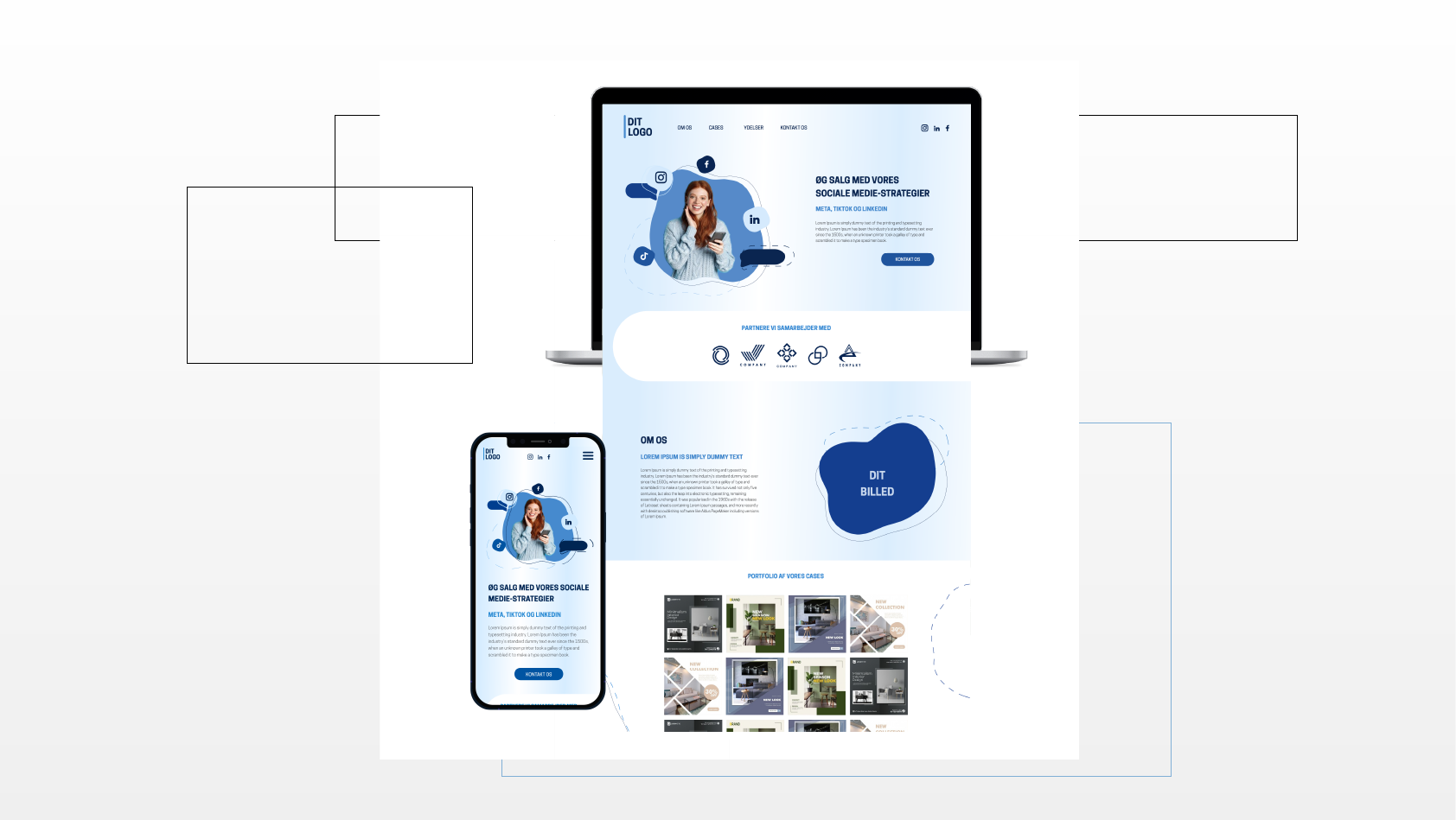
As the company is not using real life photos online, I advised to replace screenshots of the step by step guide with illustrations that would better match the identity but would also clearly and easily explain the process with the main steps, buttons and sections of the guide.
graphic designer, illustrations, blog post, google analytics, Gestalt principles, simplicity, modernism, visual identity, contrast, hierarchy
Adobe Illustrator
ILLUSTRATIONS
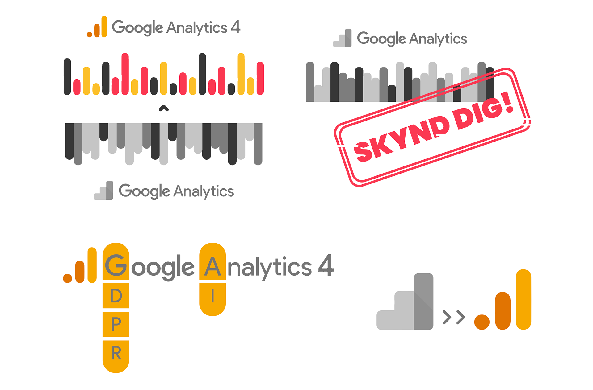
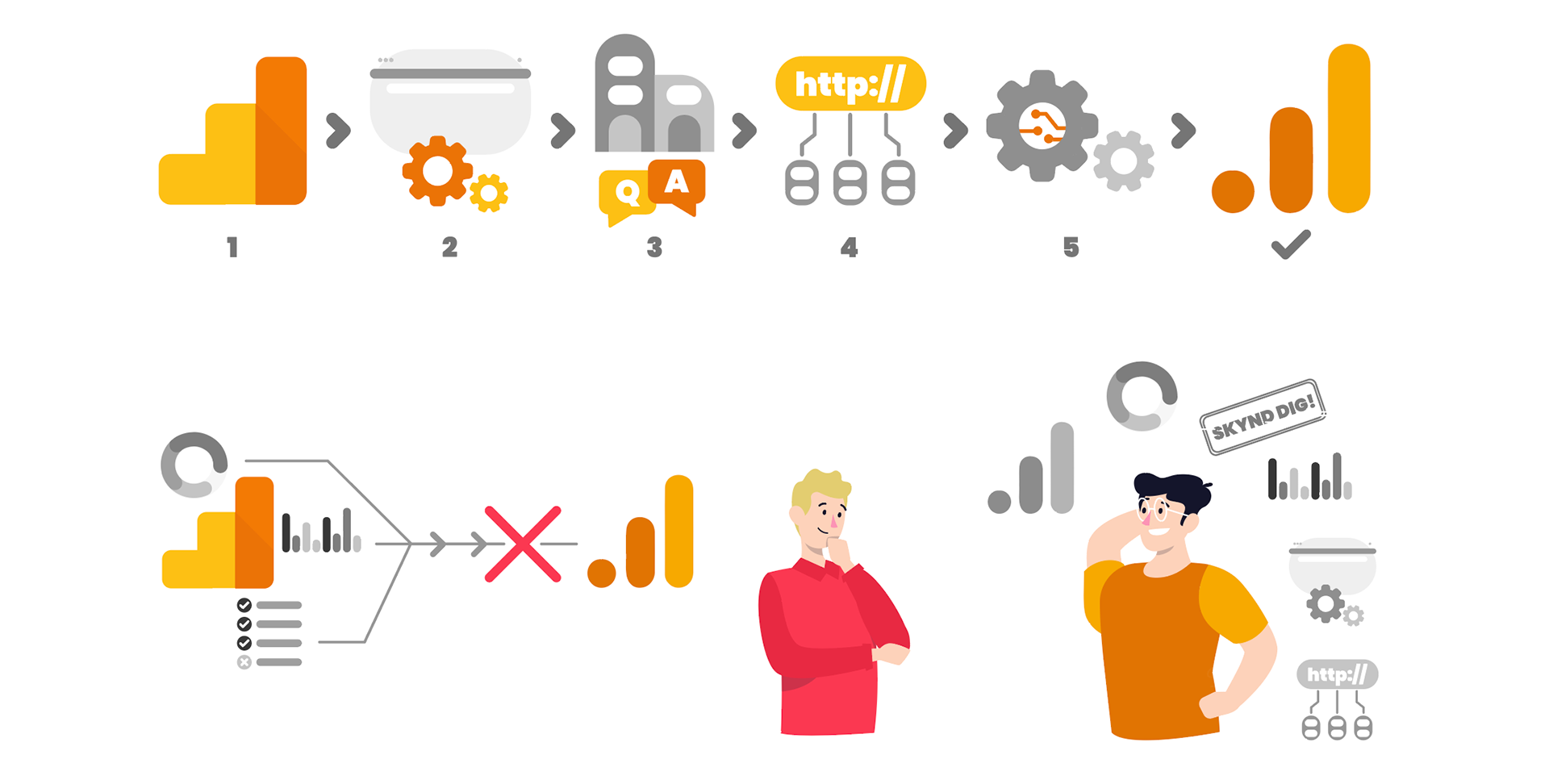
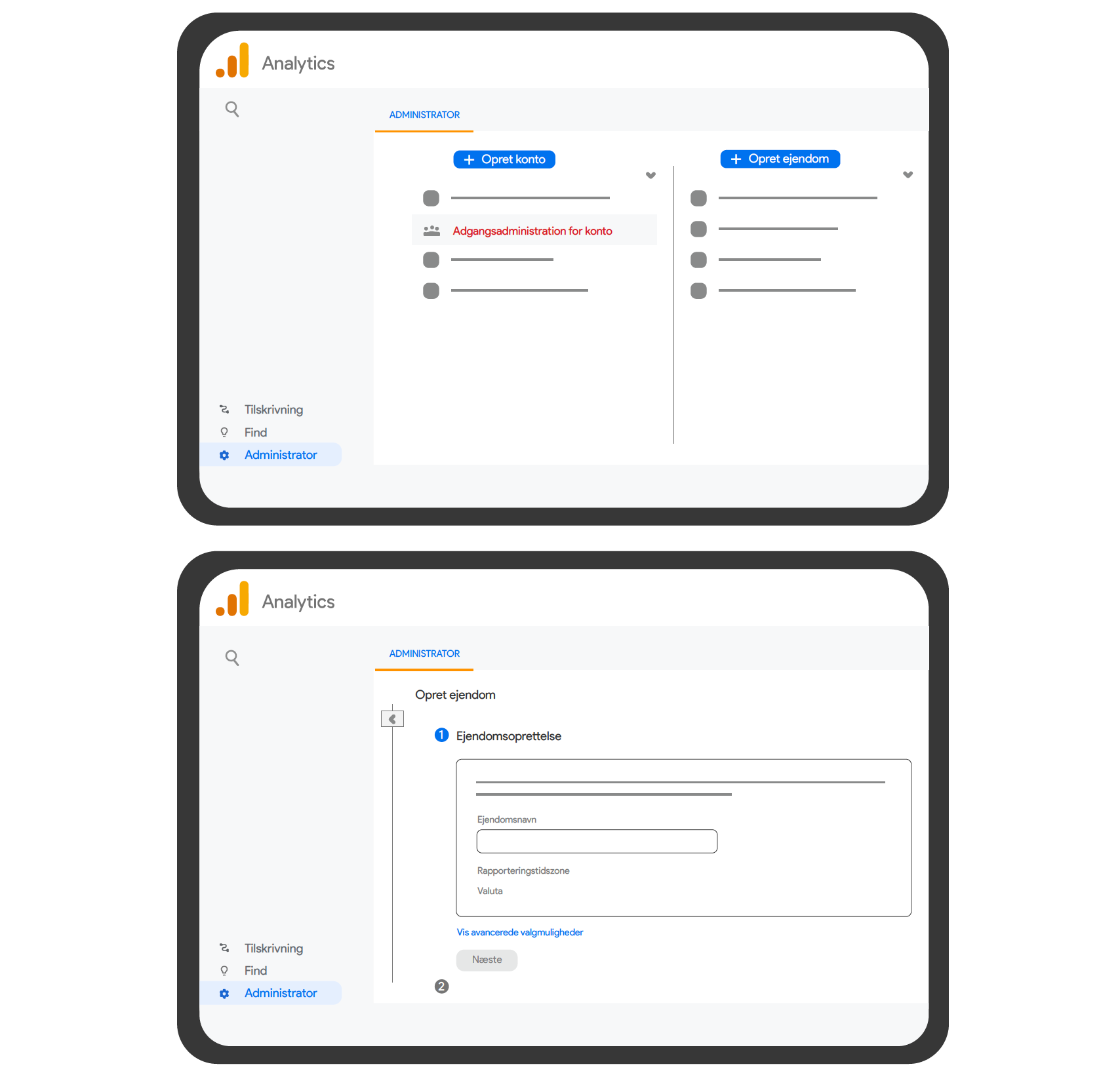
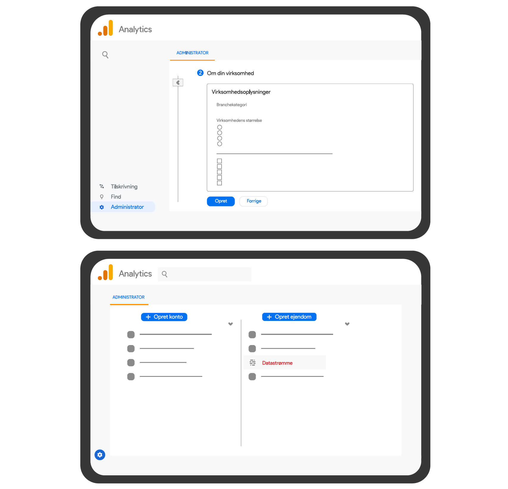
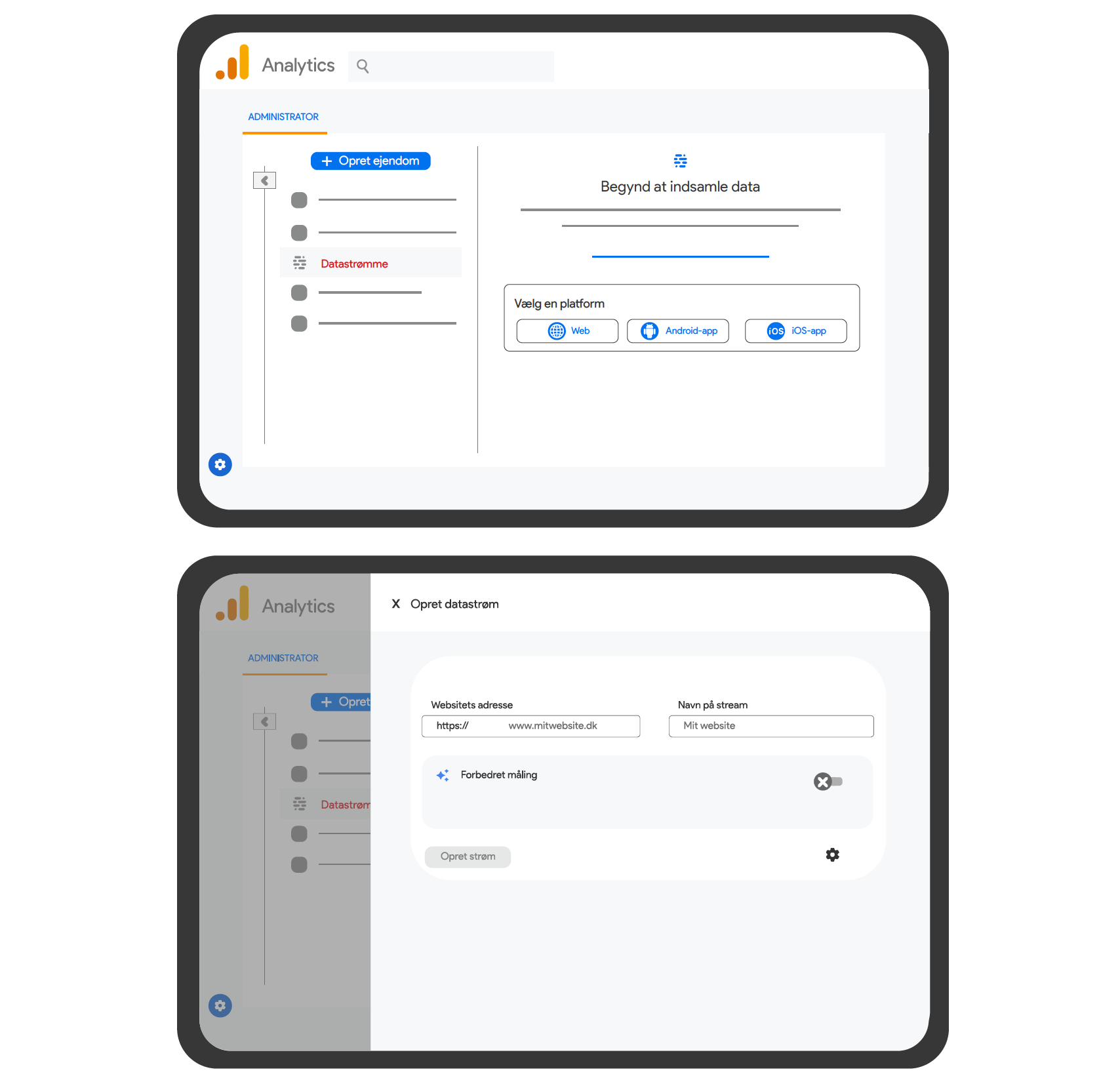
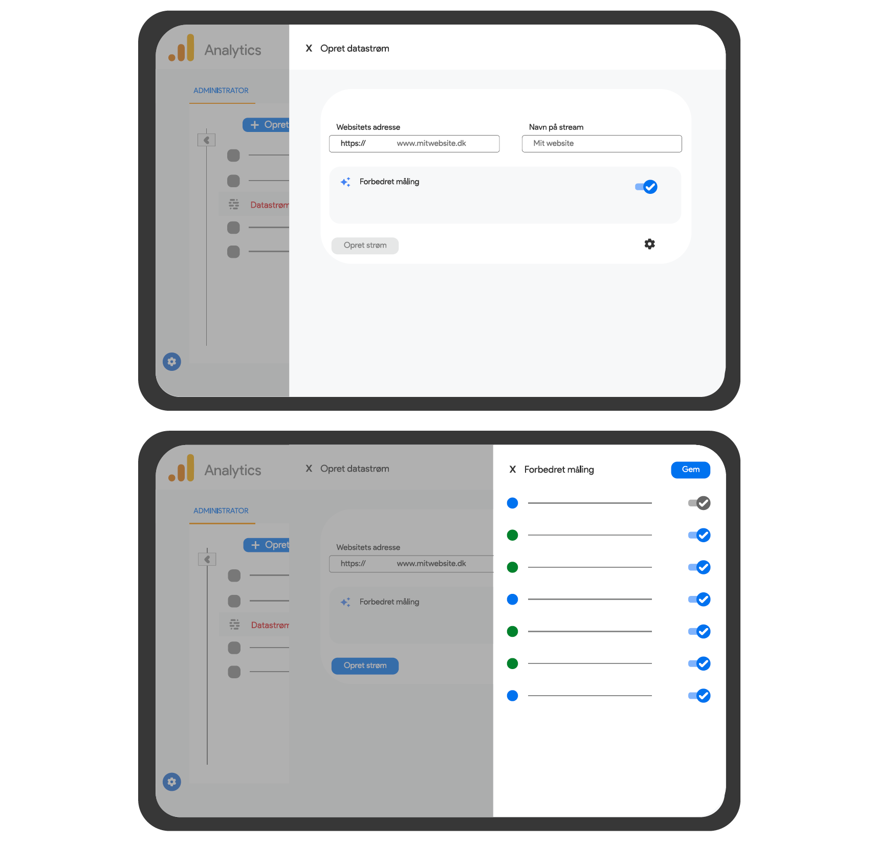
EXAMPLES OF BLOG POST SECTIONS