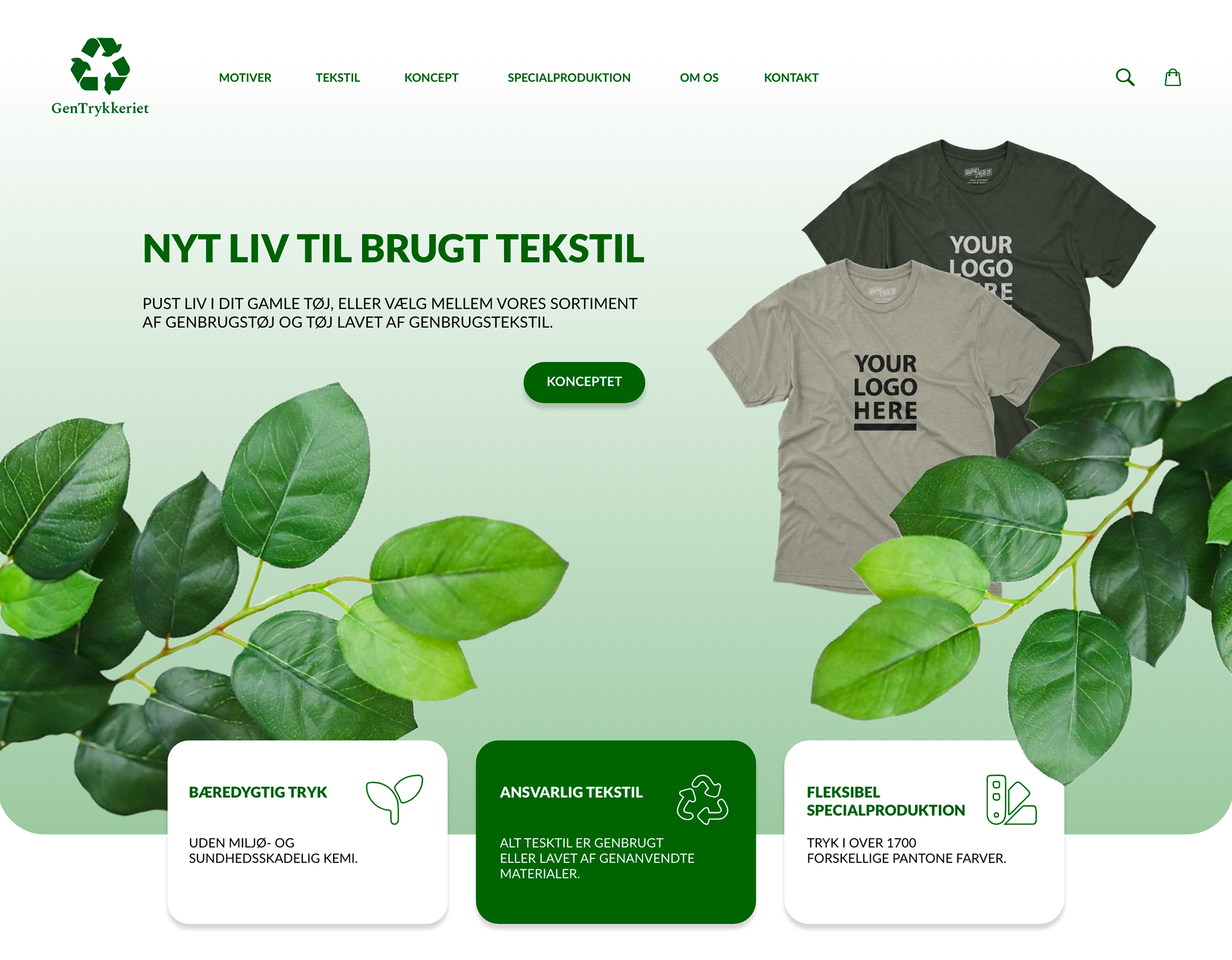
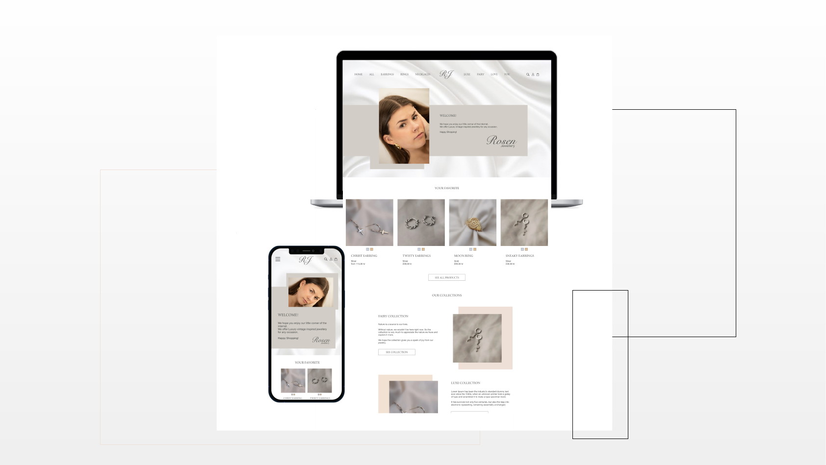
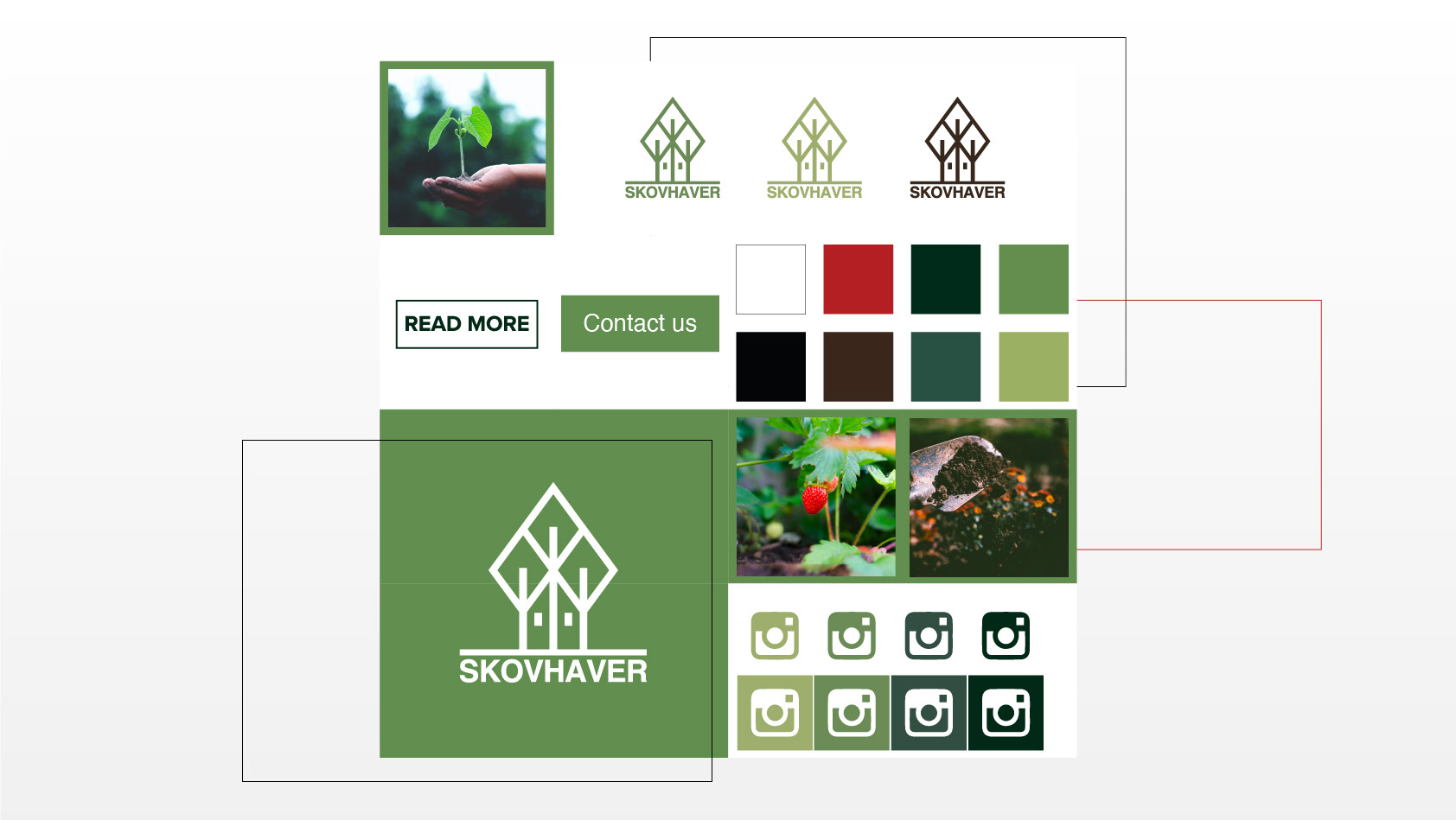
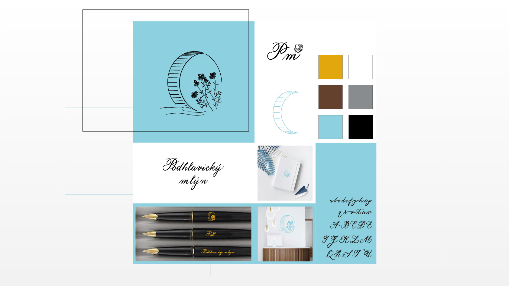
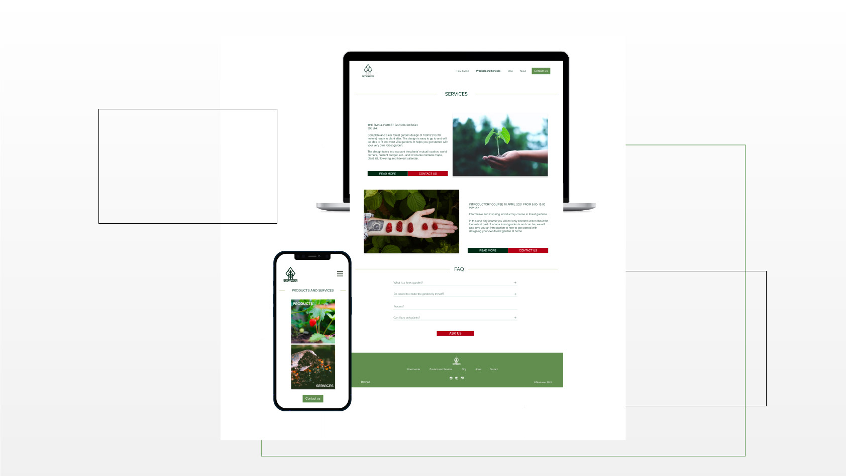
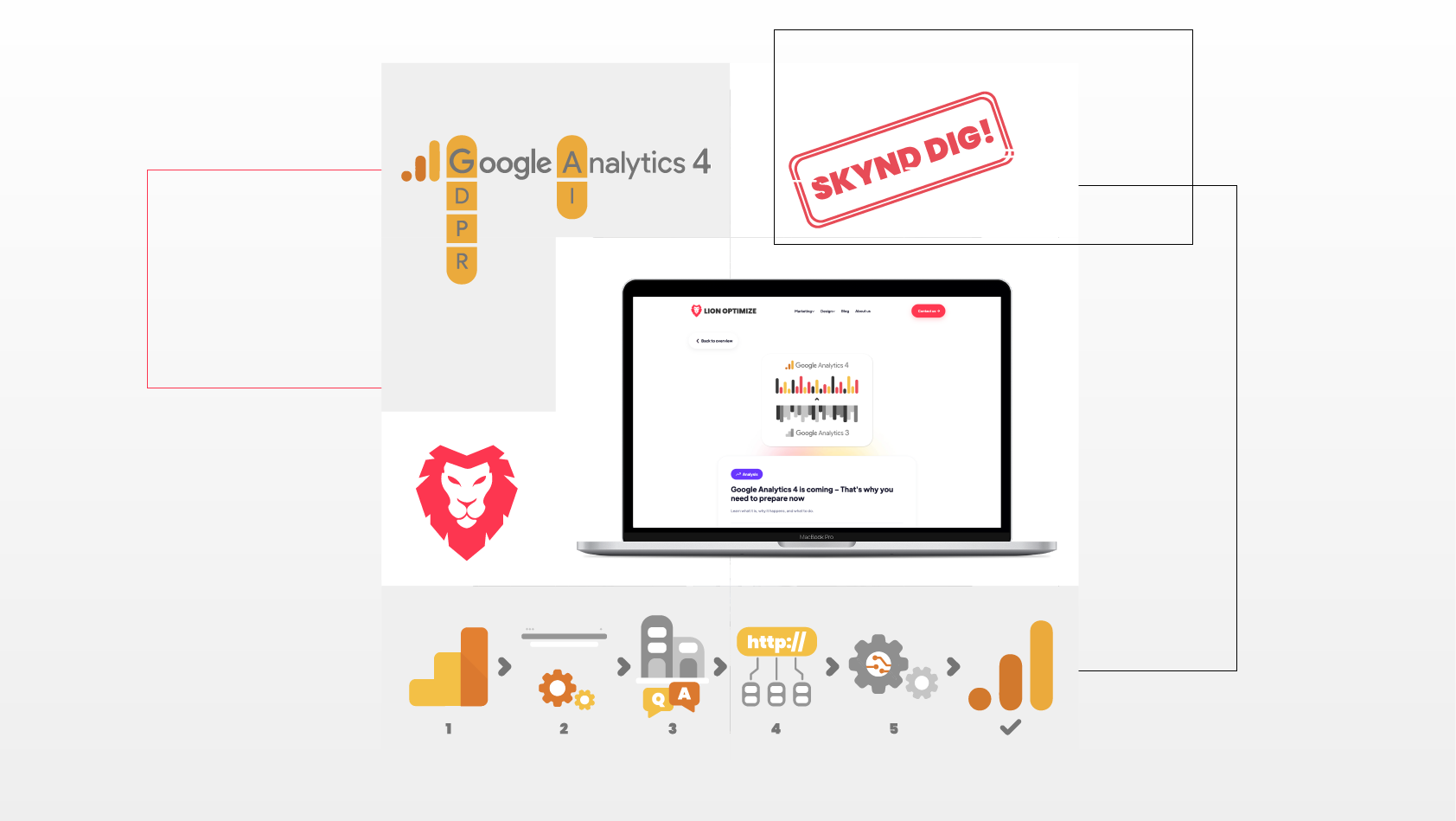
This home page prototype was designed and developed as a part of potential clients competition, where there were chosen 5 companies that were offered free visualisation of their (re)designed home page.
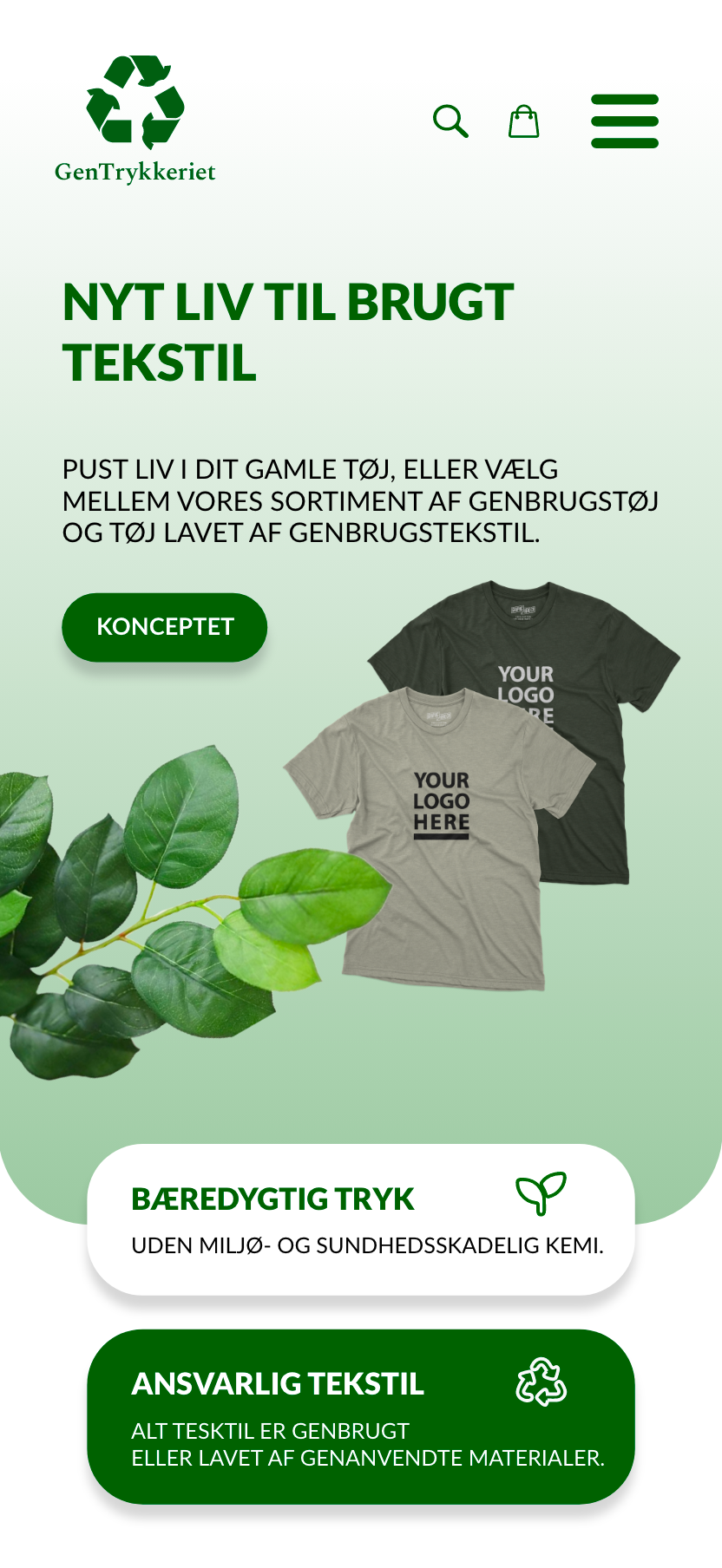
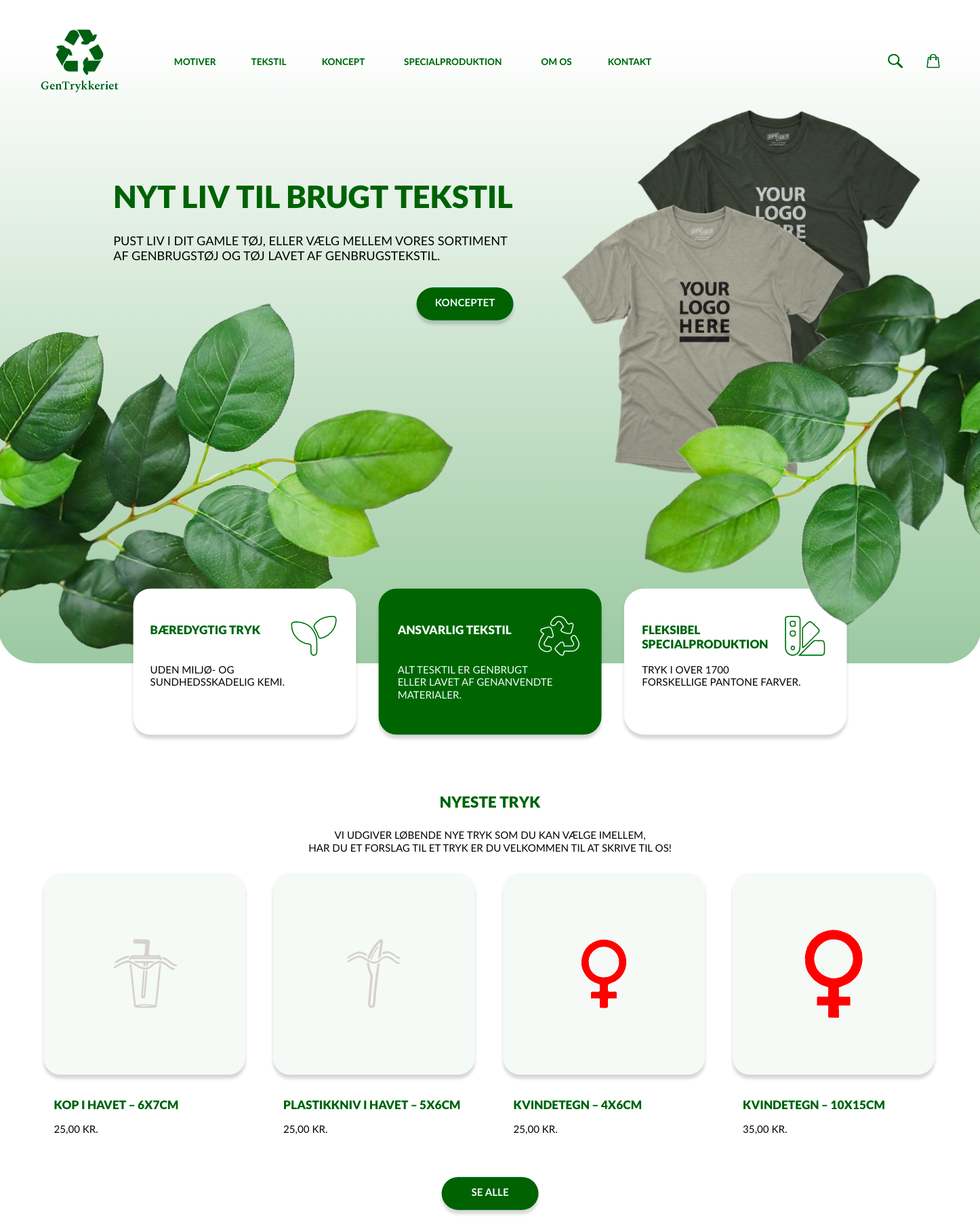
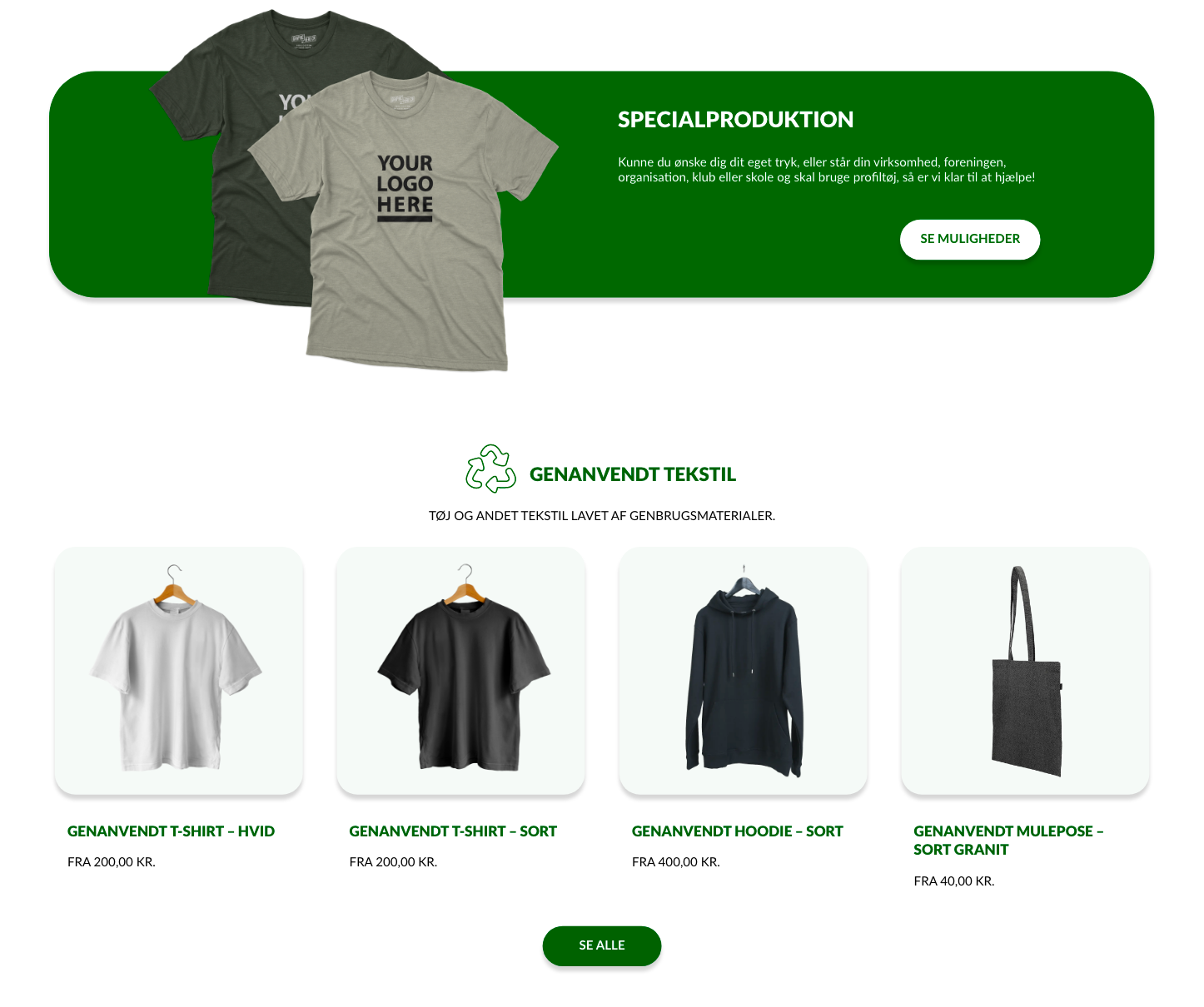
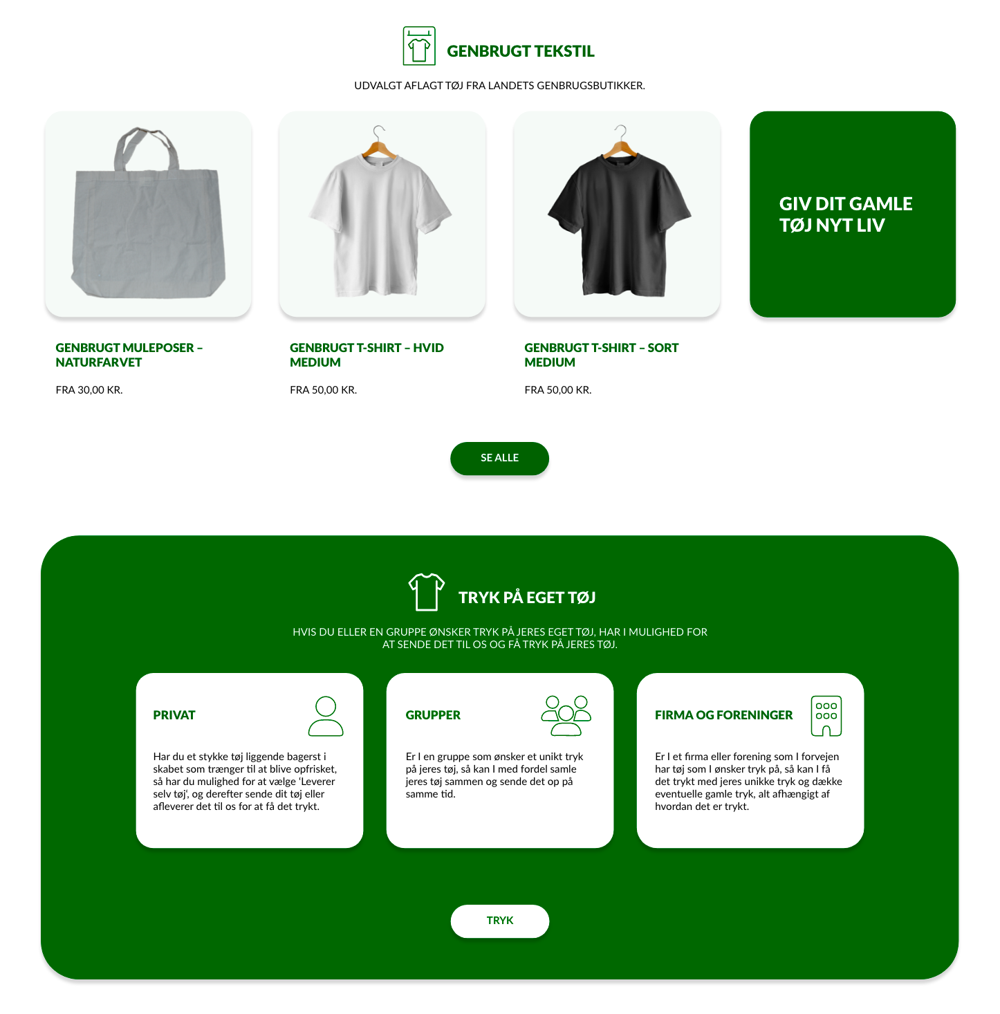
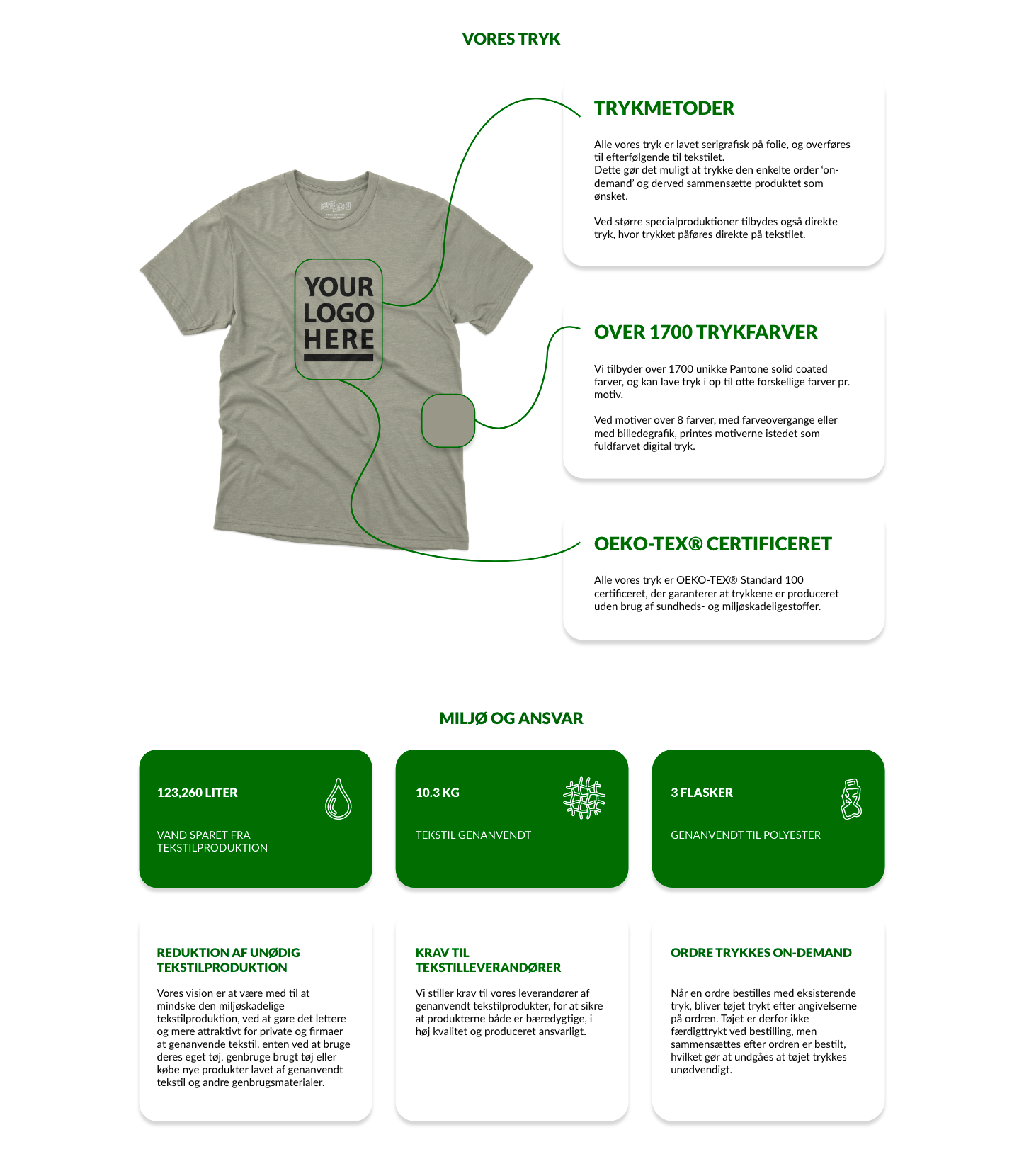
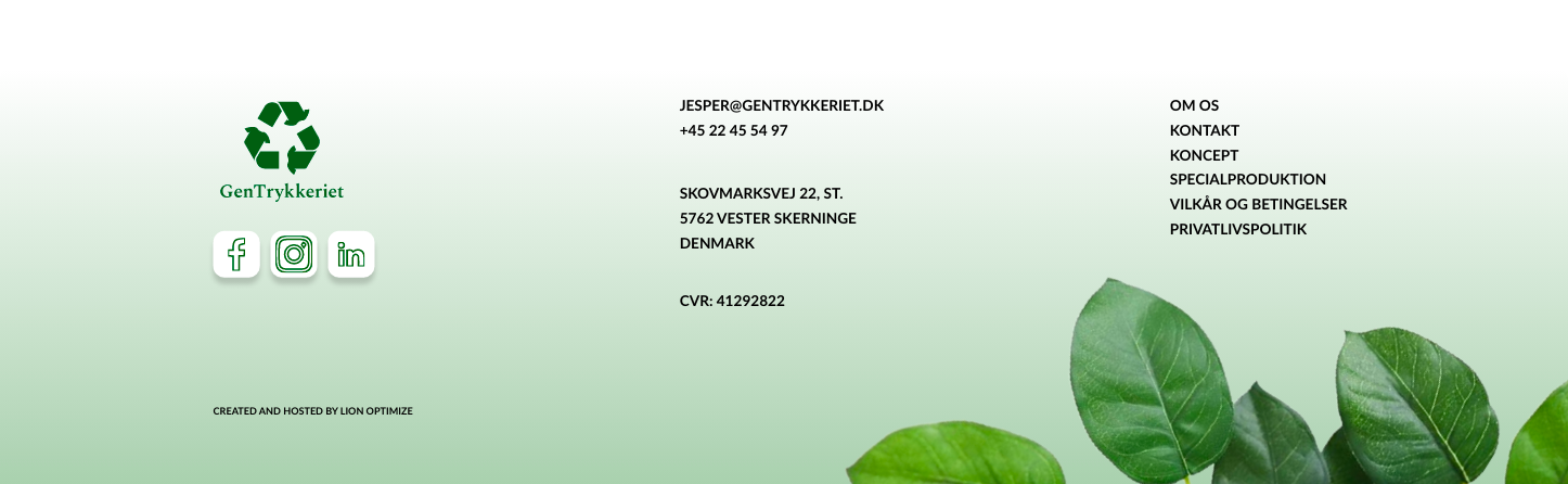
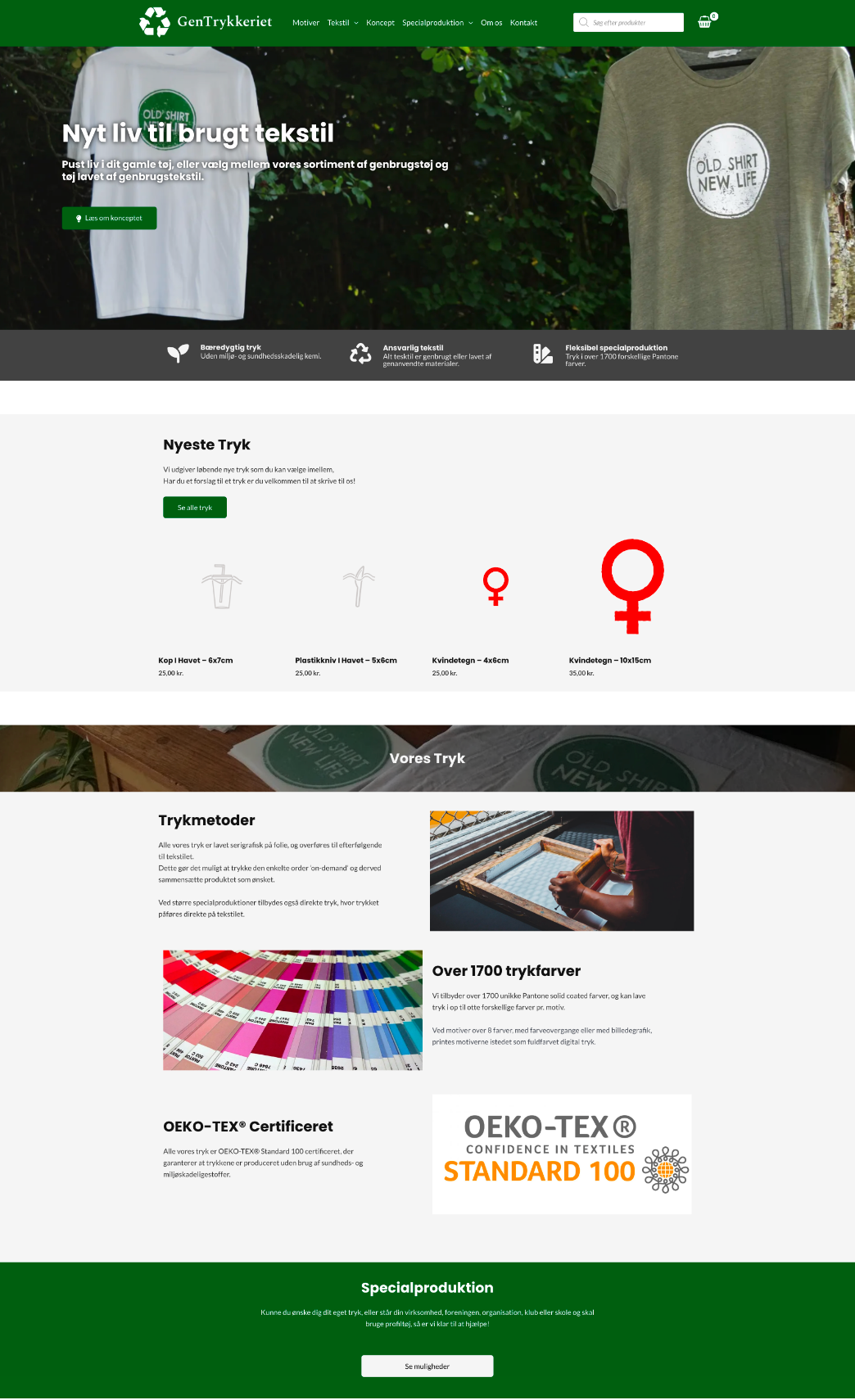
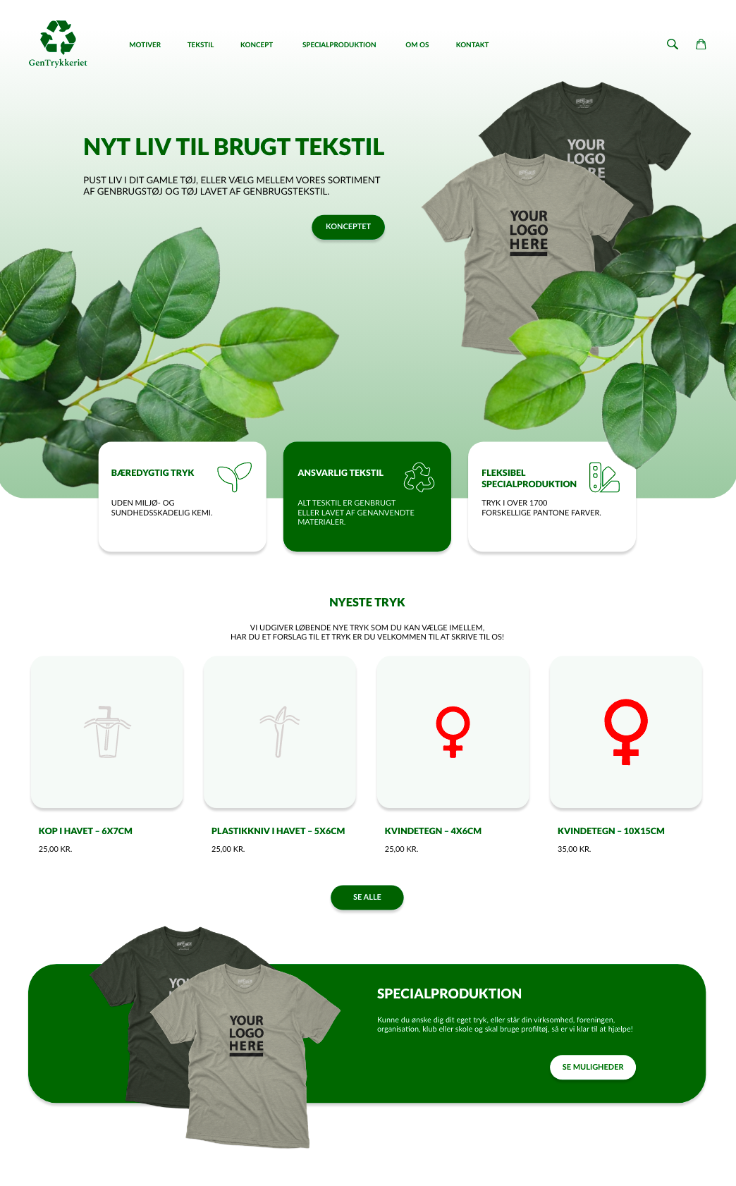
Working with the existing identity of the client and extended colour scheme with shades of green, I redesigned and developed their new home page prototype. I focused on the usage of green shades to create a hierarchy of elements and to keep the design coherent and perfectly matching the main message and focus on recycling and nature. Throughout the whole page I worked only with two types of layout in combination with negative space to assure the structure being not heavy on the eye and easy to understand. I worked with a combination of stock images and text ideas used as placeholders and their actual verbal and visual content to show the potential direction to grow and improve. I avoided problems related to readability by working with the contrast of colours and weight of letters.
prototype, home page, website, Gestalt principles, structure, layout, negative space, focus, simplicity, modernism, nature, recycling
Adobe Xd, Adobe Photoshop
HOME PAGE
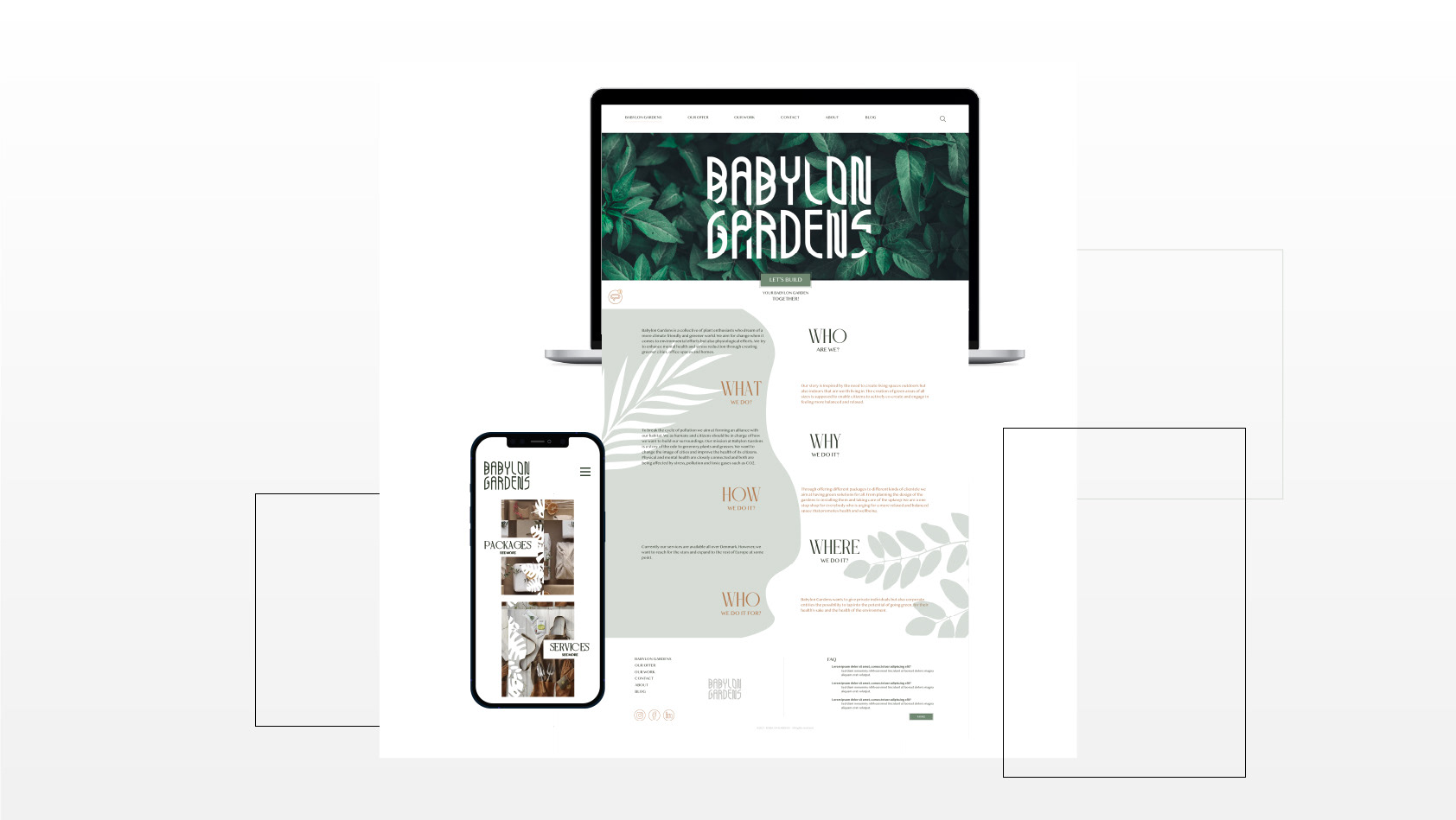
CLIENT'S ORIGINAL WEBSITE vs. PROTOTYPE
LAPTOP vs. MOBILE VERSION